5/2019–12/2020
UI/UX, Rebranding
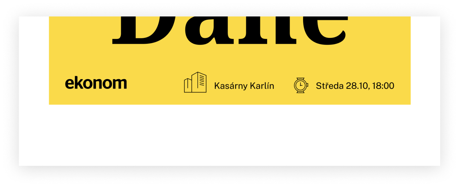
Ekonom magazine
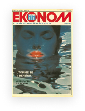
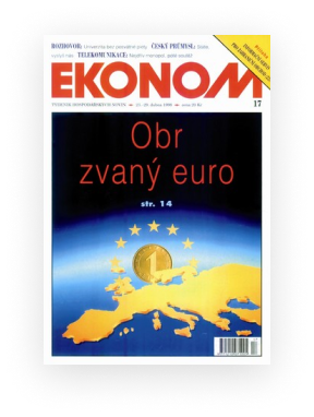
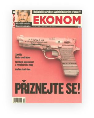
Since 1991 Ekonom is the most widely read economic weekly journal on the Czech market. It provides you with the information you need to navigate today’s complex world.
Till autumn 2020 Ekonom was a supplement of the newspaper Hospodářské noviny. Once separated, there was a need for complete rebranding.

Role
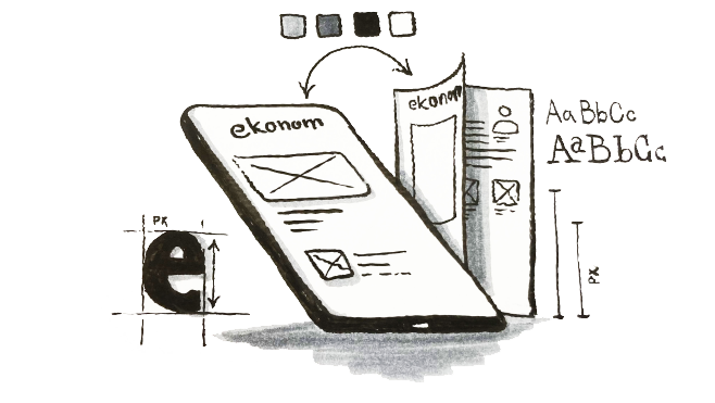
My role was setting a visual language and take care off a digital part - web and app.
Big cleaning
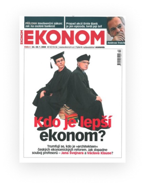
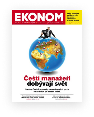
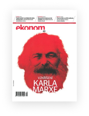
Nobody touched the brand for a long time and that means chaos.
The first step was getting to all touchpoints.


Set up a consistency
Finding a way to connect the printed magazine and digital experience.
Based on history
It was important for to follow the original philosophy of communication.
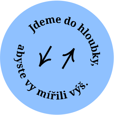
Stay bold, memorable, and clearly different from the competition.
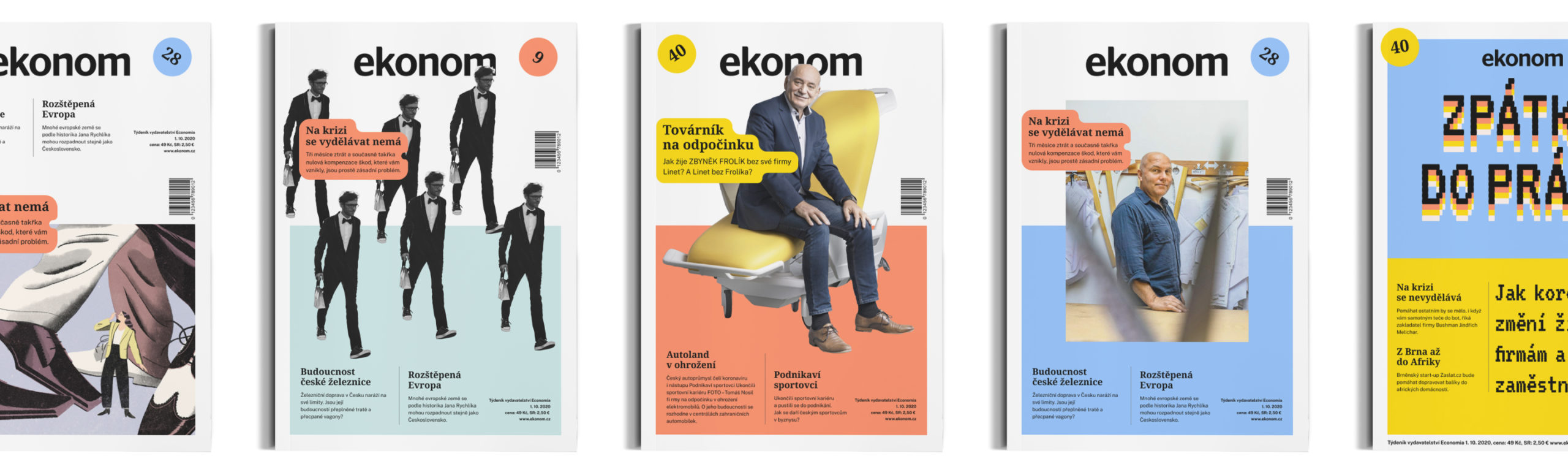
Cutting the title into 2 halves opened many possibilities to play.
Logotype and name
The logo remains, but we supplement it with the necessary logo manual and instructions for use. At the same time, it is easily accessible to our partners.
"Ekonom" is always written with a capital E.
We labeled the sections of the web, magazine, and sub-brand of Ekonom.

Fonts that I used in web and print.


Colors definition
We use 2 color series. Any color saturation can be used for illustration and graphics, but there must be a primary predefined shade.
Primary colors

Background colors


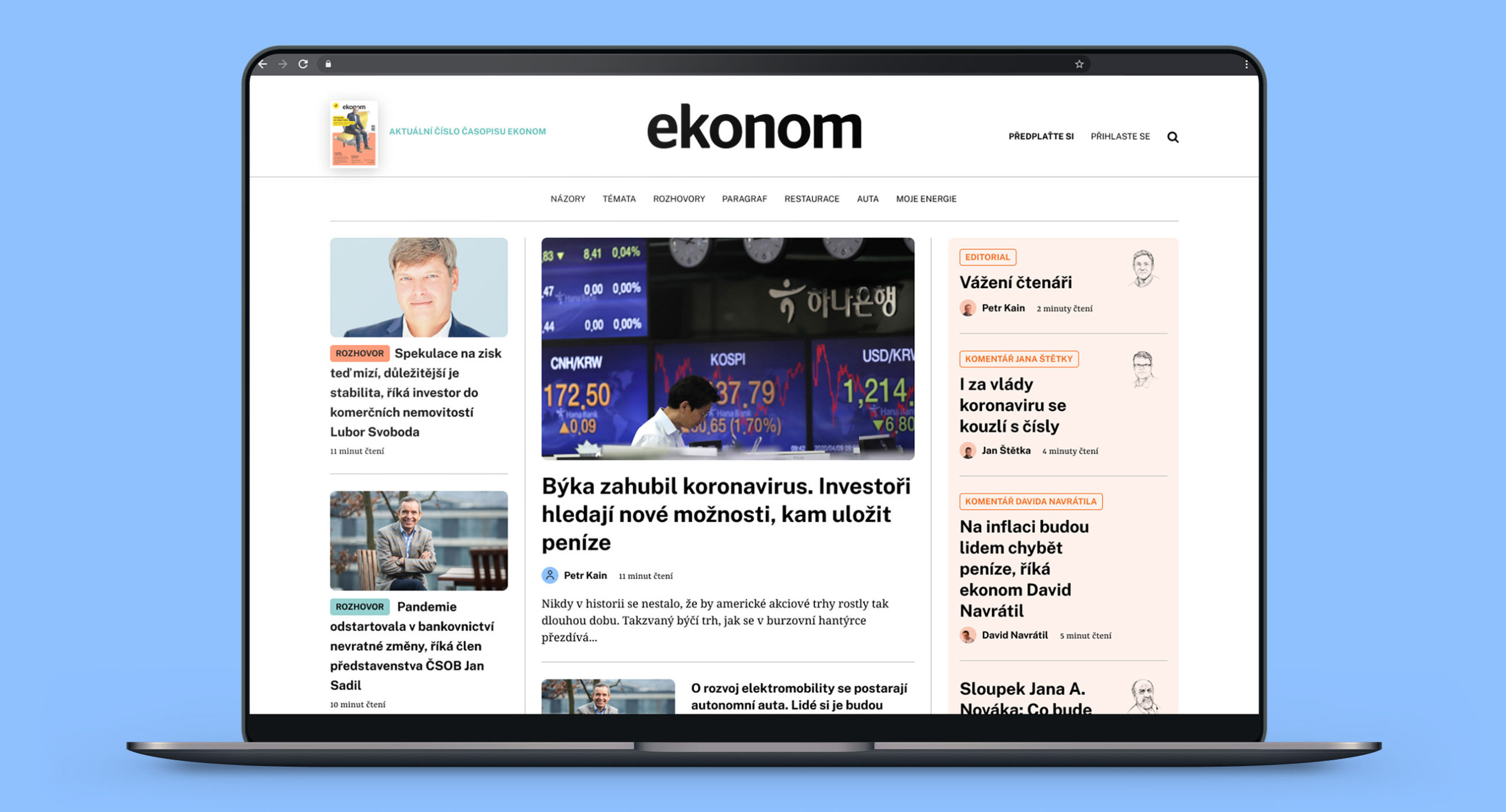
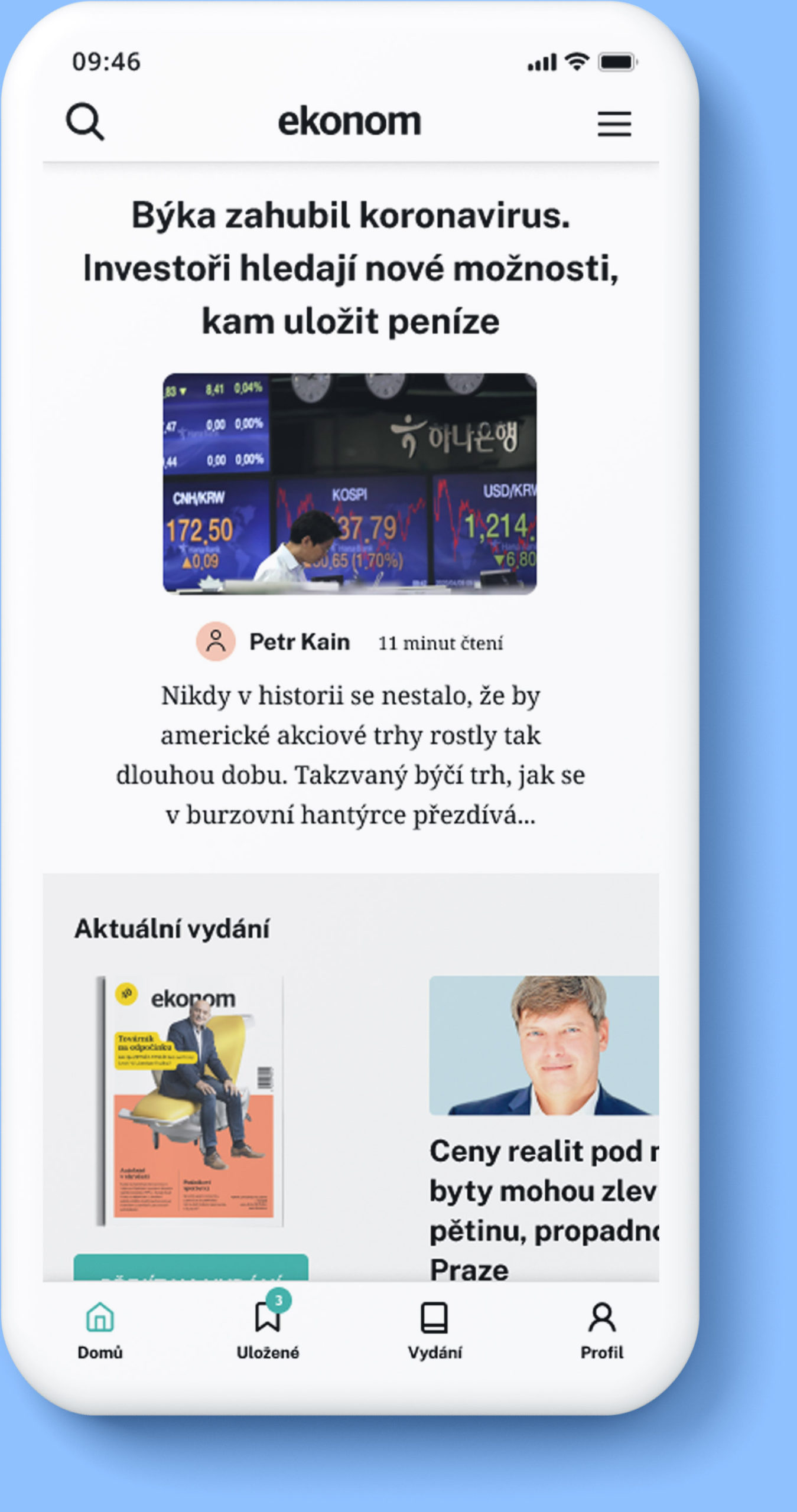
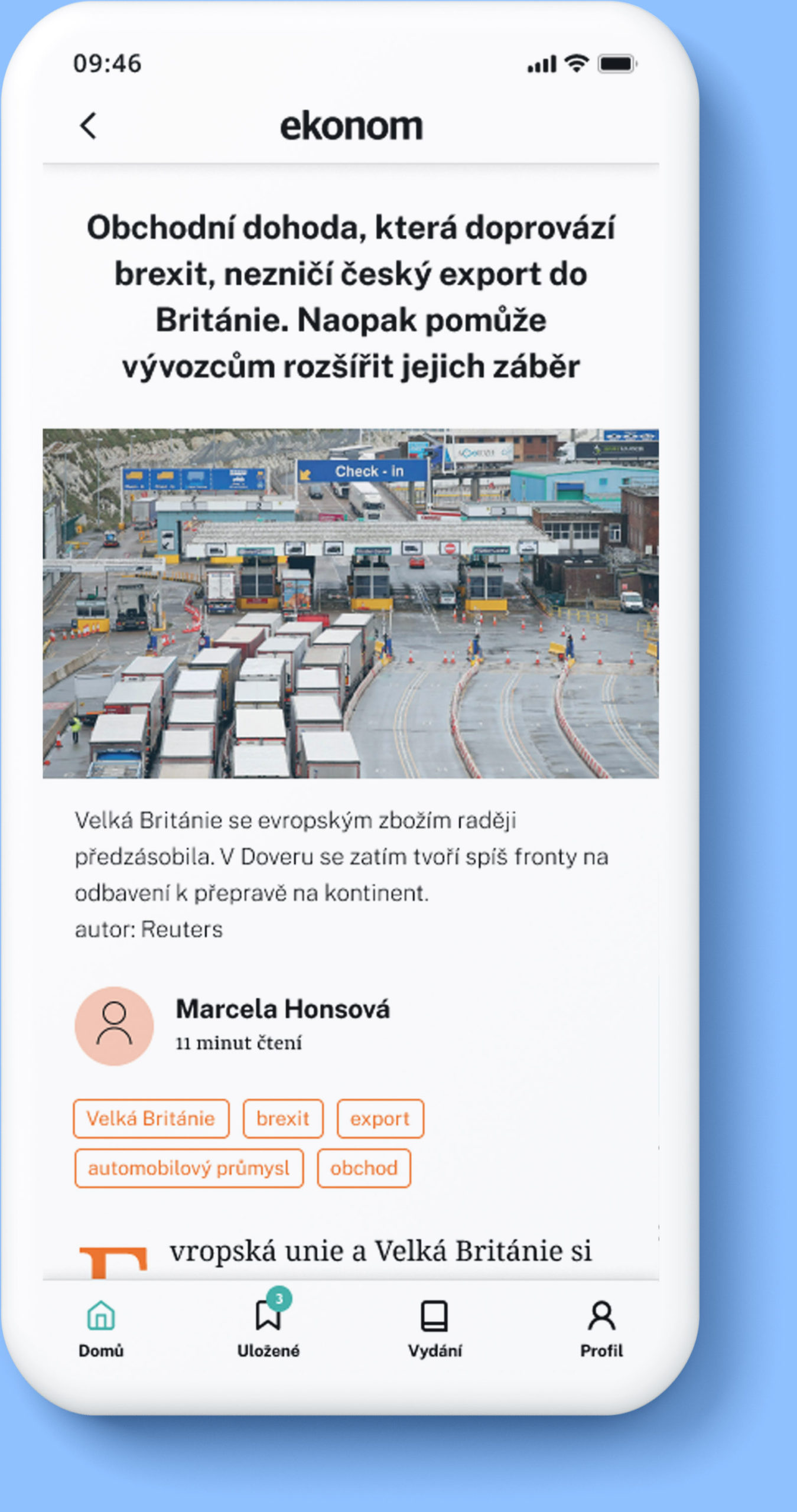
Website and app

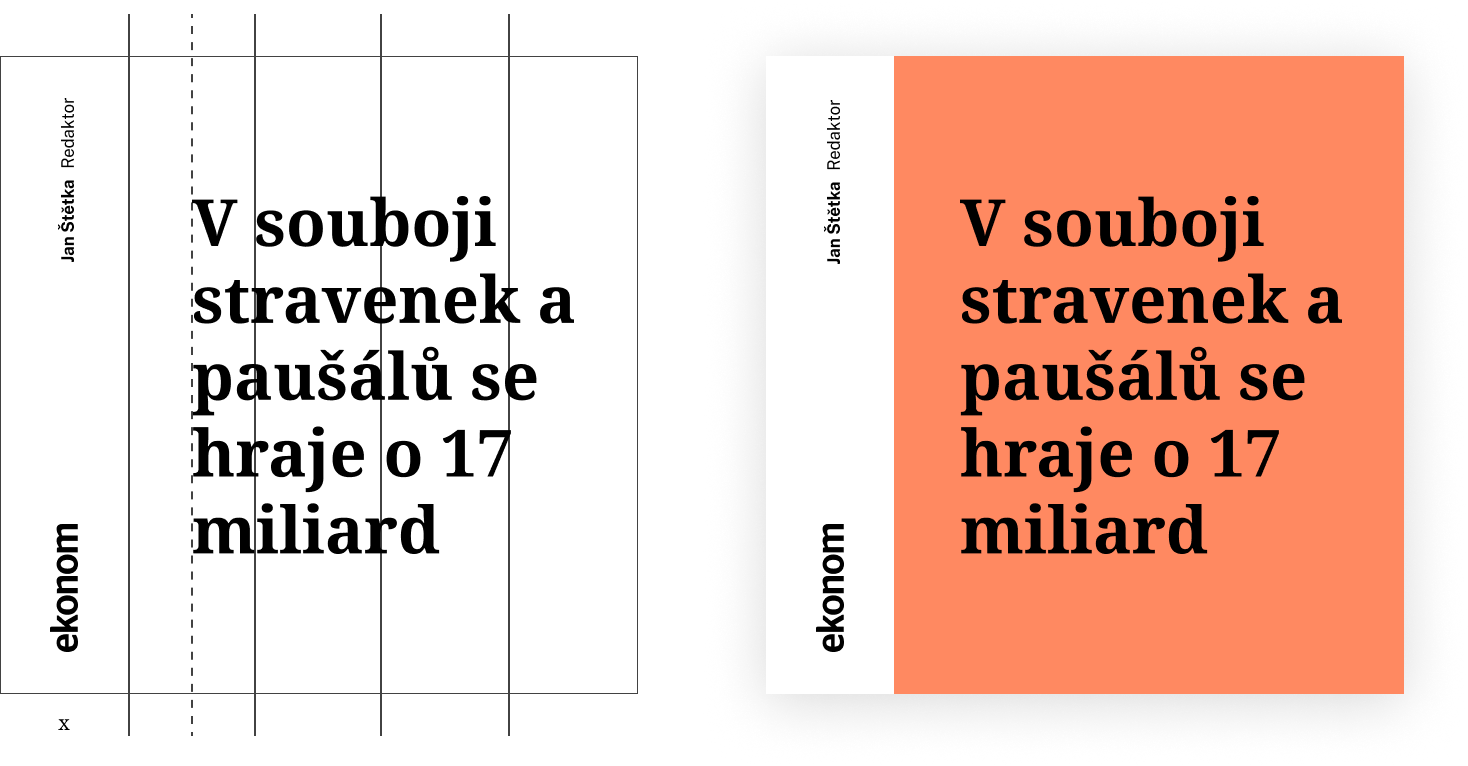
Graphic elements and composition
Our visual language is based on solid surfaces and contrast.
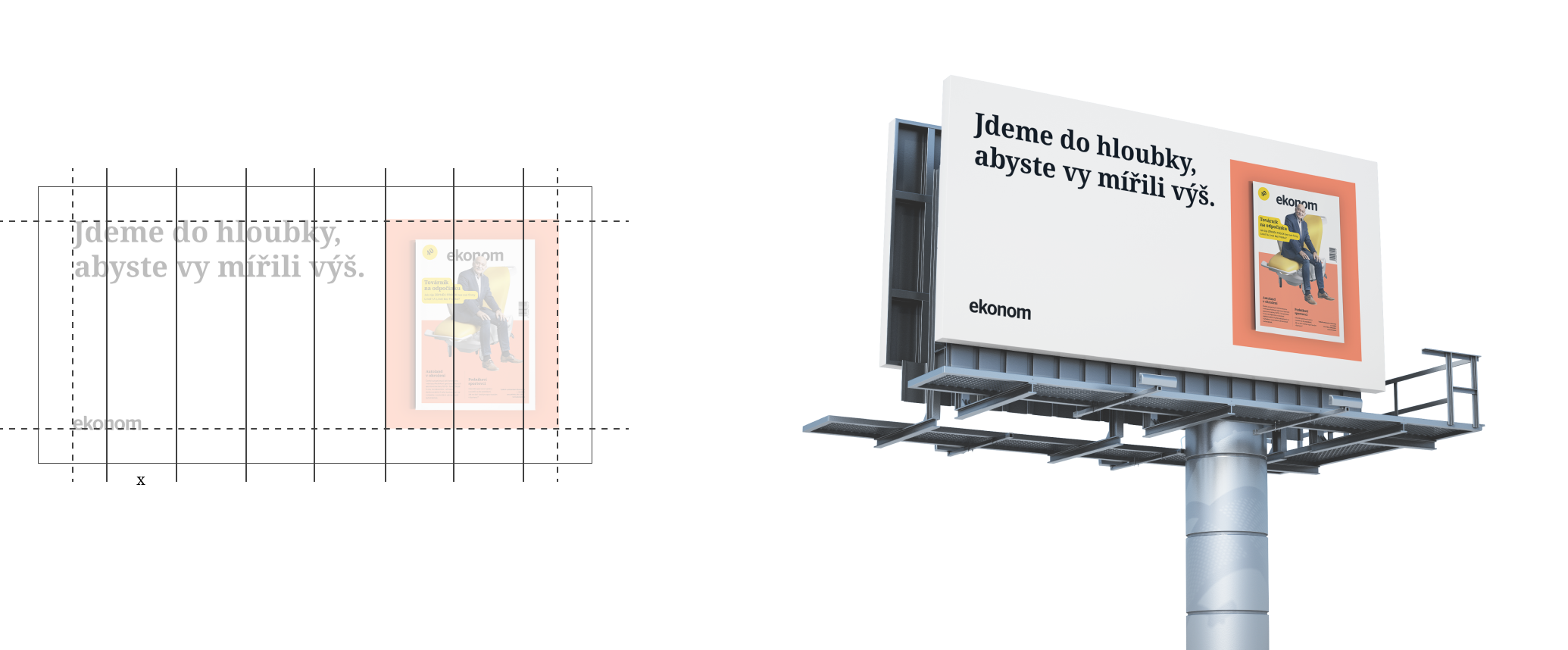
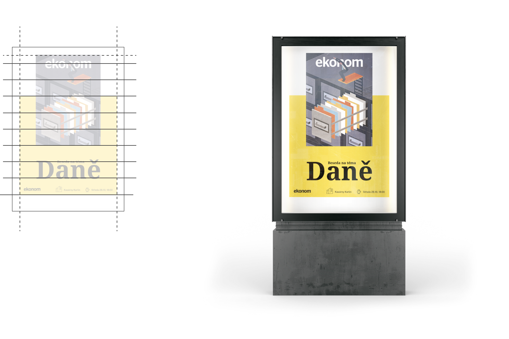
The size X (column width) determines the size of the logo.
The division font is at least 2 times larger than the logo.
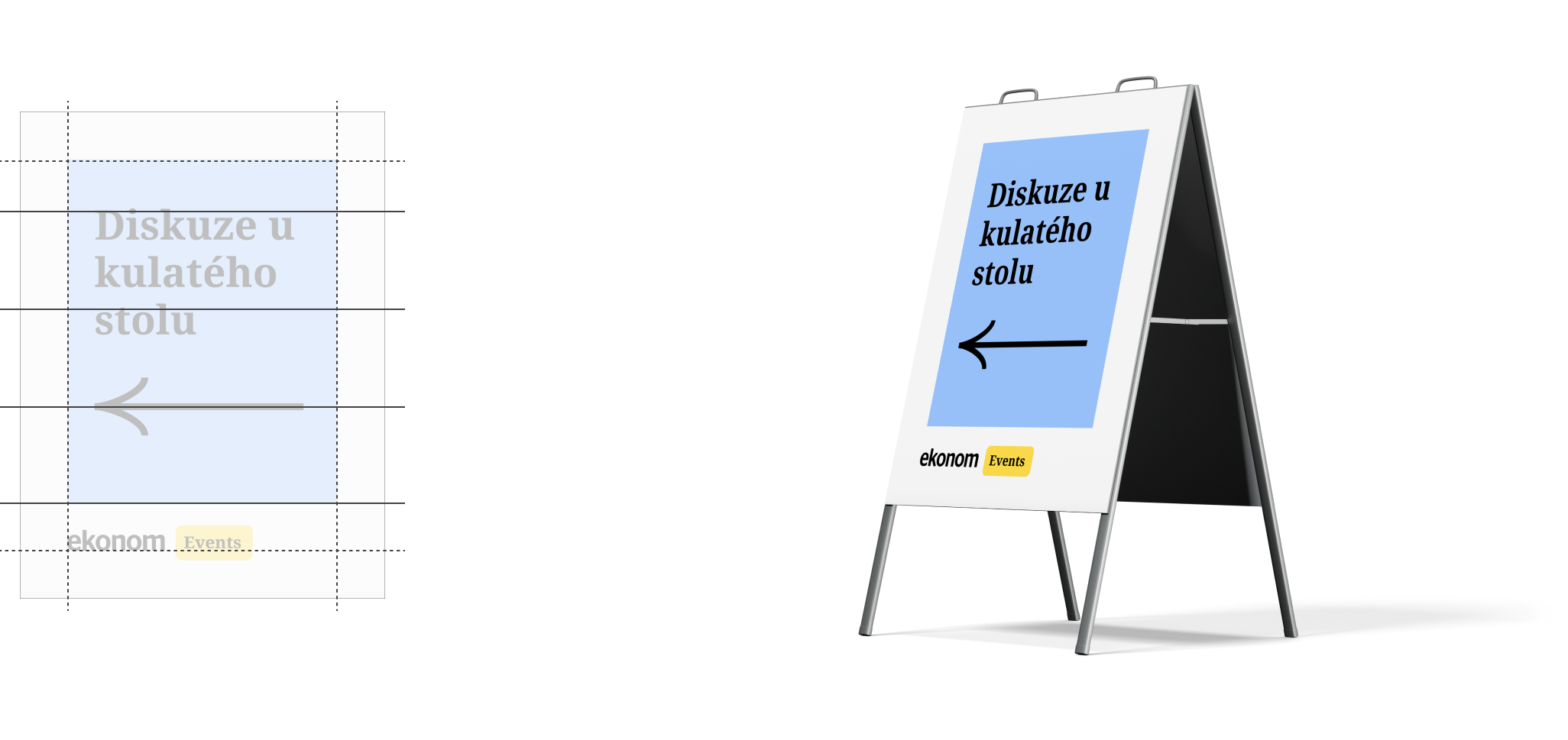
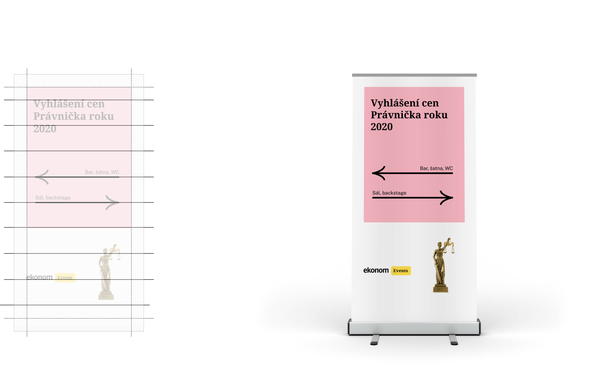
Outdoor
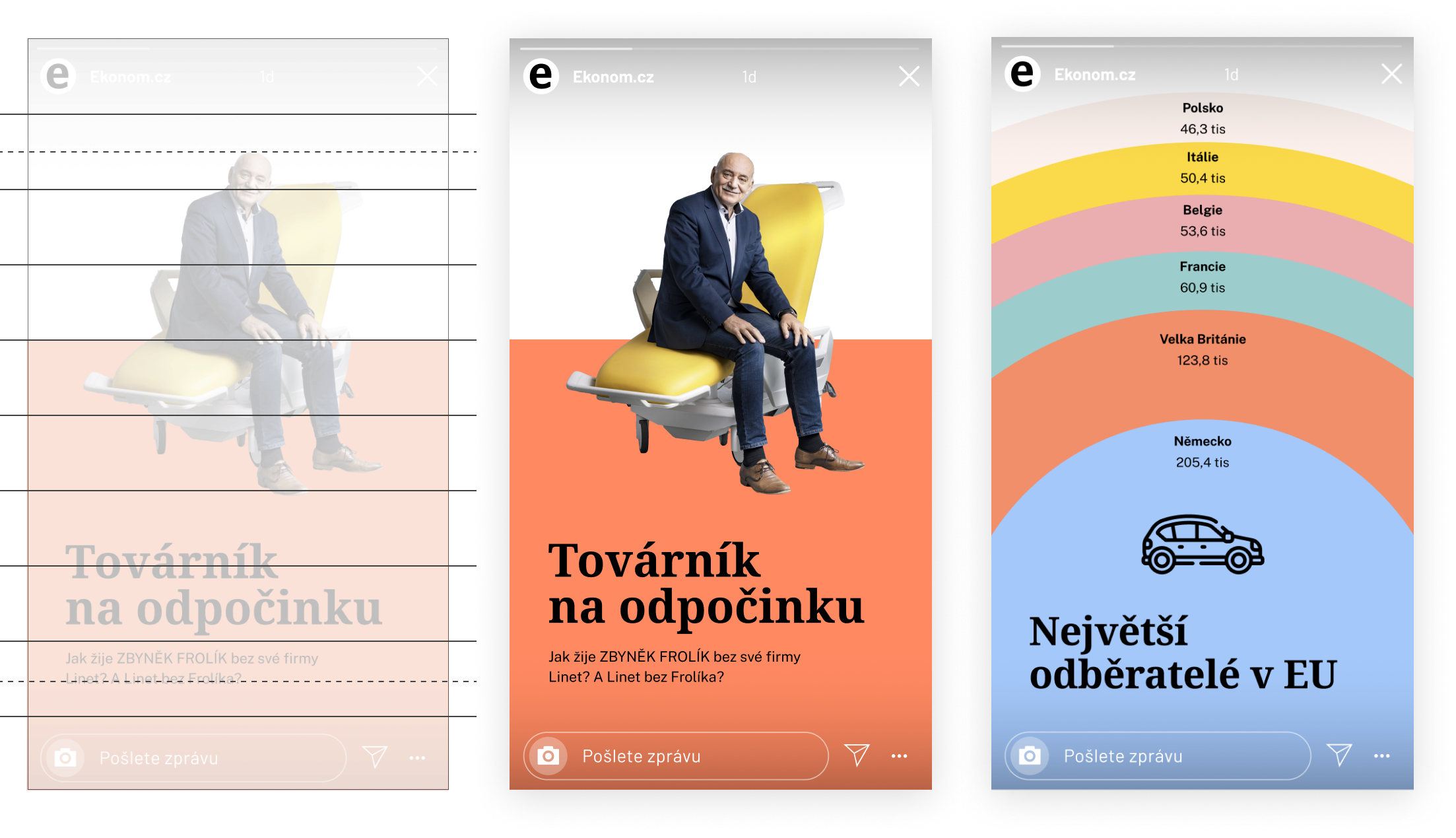
Social
Navigation
Tips for social
Social networks are a platform for us where we become a service to others.
- We put the content in an understandable form.
- Extract the most important message.
- Build a community and prestige.
- We are interested in the opinion of people around us.
- Encourage discussion.
The post is not just about sharing an article, we make an extract of the most interesting thing we write about in the thread below it.

We encourage discussion and are interested in the opinions of our readers.
We speak directly and objectively. The content here is self-sufficient and encourages deeper exploration.
- The editors take over the account themselves and show how the content is created. People can put things into context.
- We are not afraid to go down in history and search for timeless articles.
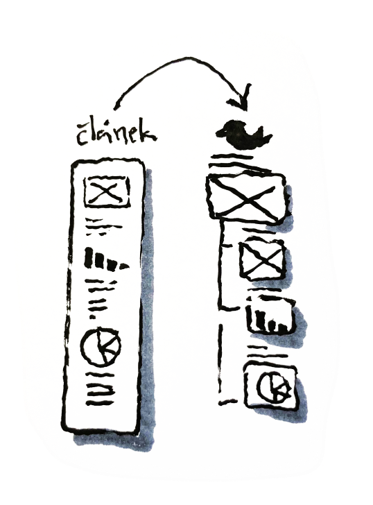
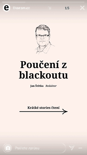
- We publish opinions and shorter articles through stories.
- Simple explainers in up to 7 stories
Iconography and dot


Dot is used as design disruptor; you can put it wherever you find it useful.

Summary at the end
1.
Allow the content
to breathe
2.
Focus on the contrast
3.
Build trust with consistency
Our new visual language name is Xenofon :)
It was an ancient Greek philosopher who first used the word economist "Oikonomikos"
Other Works
Respekt appUX/UI redesign
Studenta magazineCase study, UX/UI
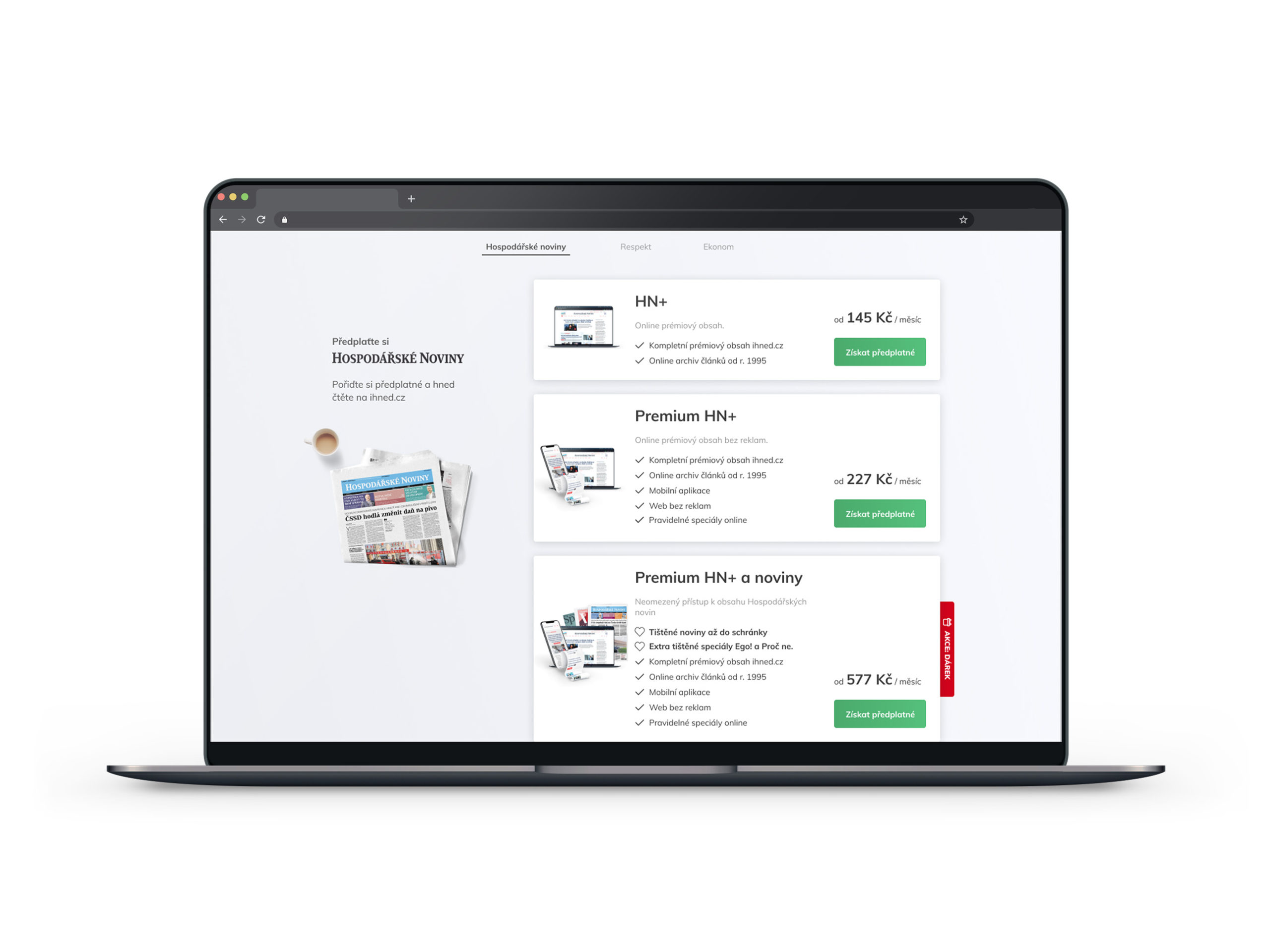
Economia eshopUI/UX redesign

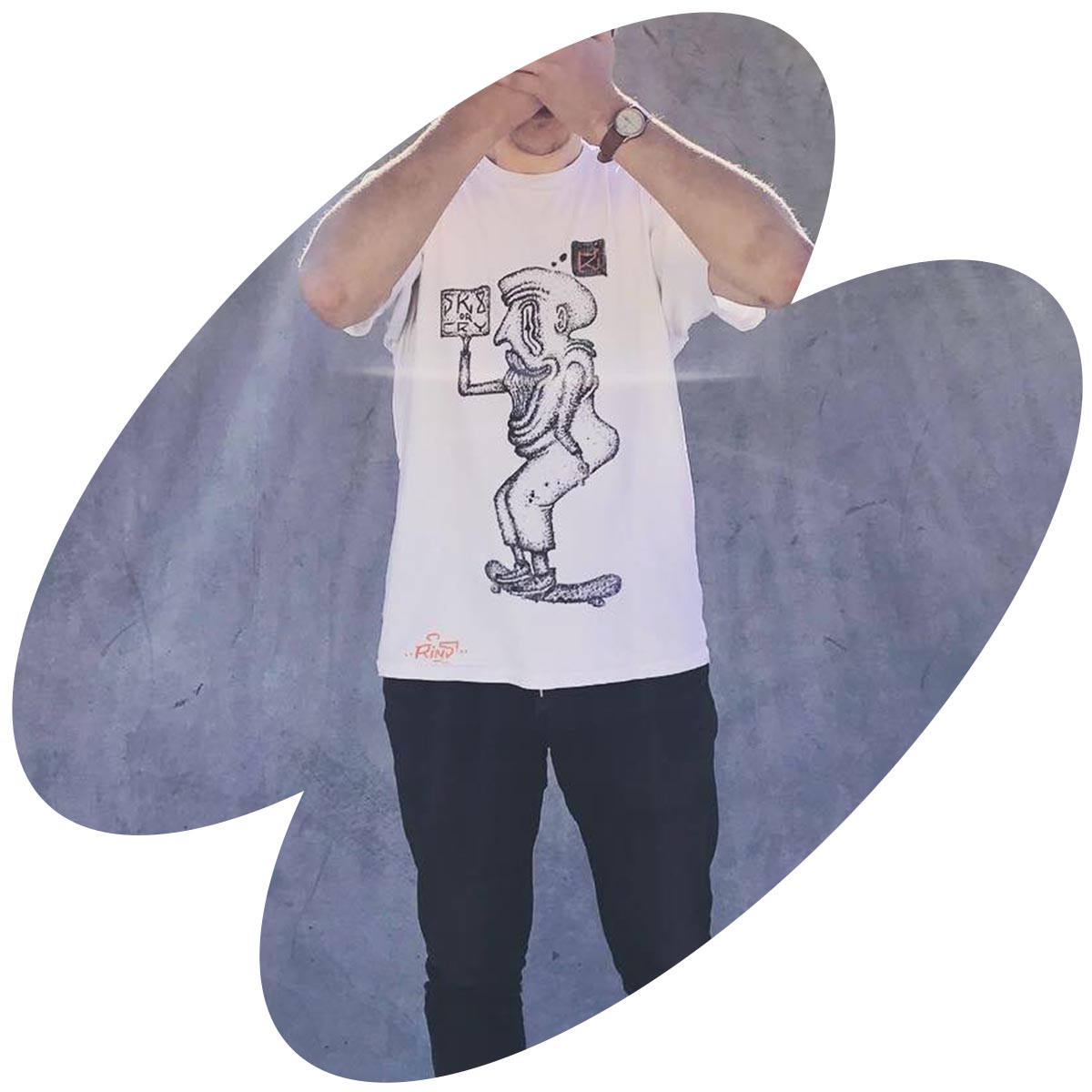
Sewer boysFanzine about Prague undeground
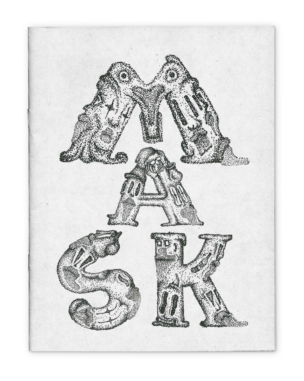
MASKSFanzine about everyday draw
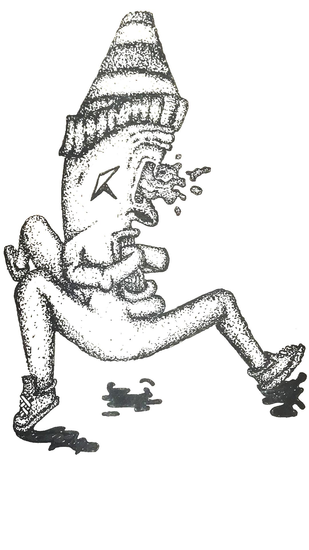
ProtectorEveryday draw
My thingsImprove them
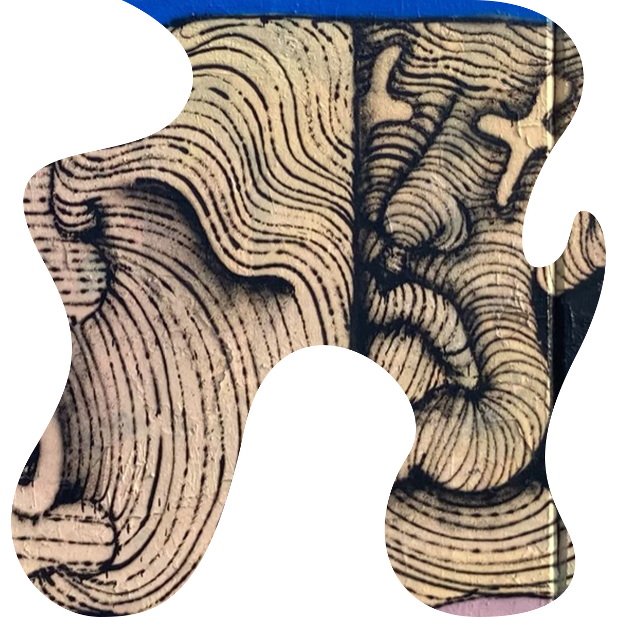
Paintings on the wallillustration
Feel free to call me, or text me.
email: studiorine@gmail.com
phone: +420 737 004 928
© 2021 Matěj Kvasnička