6/2020
Product design
Respekt
mobile app
Respekt is a weekly newsmagazine that was founded very soon after the fall of the Communist party in 1989, as part of Velvet Revolution. Today I consider Respekt as a guardian of free speech in the Czech Republic, and one of most "loved & hated" brands.
I completed this project with my colleague Lukáš (UX) who worked mostly on the audio player and helped with research.
Summary
- Users’ needs and technical problems.
- Structure and logic of usability.
- Taking apart and revising UI components.
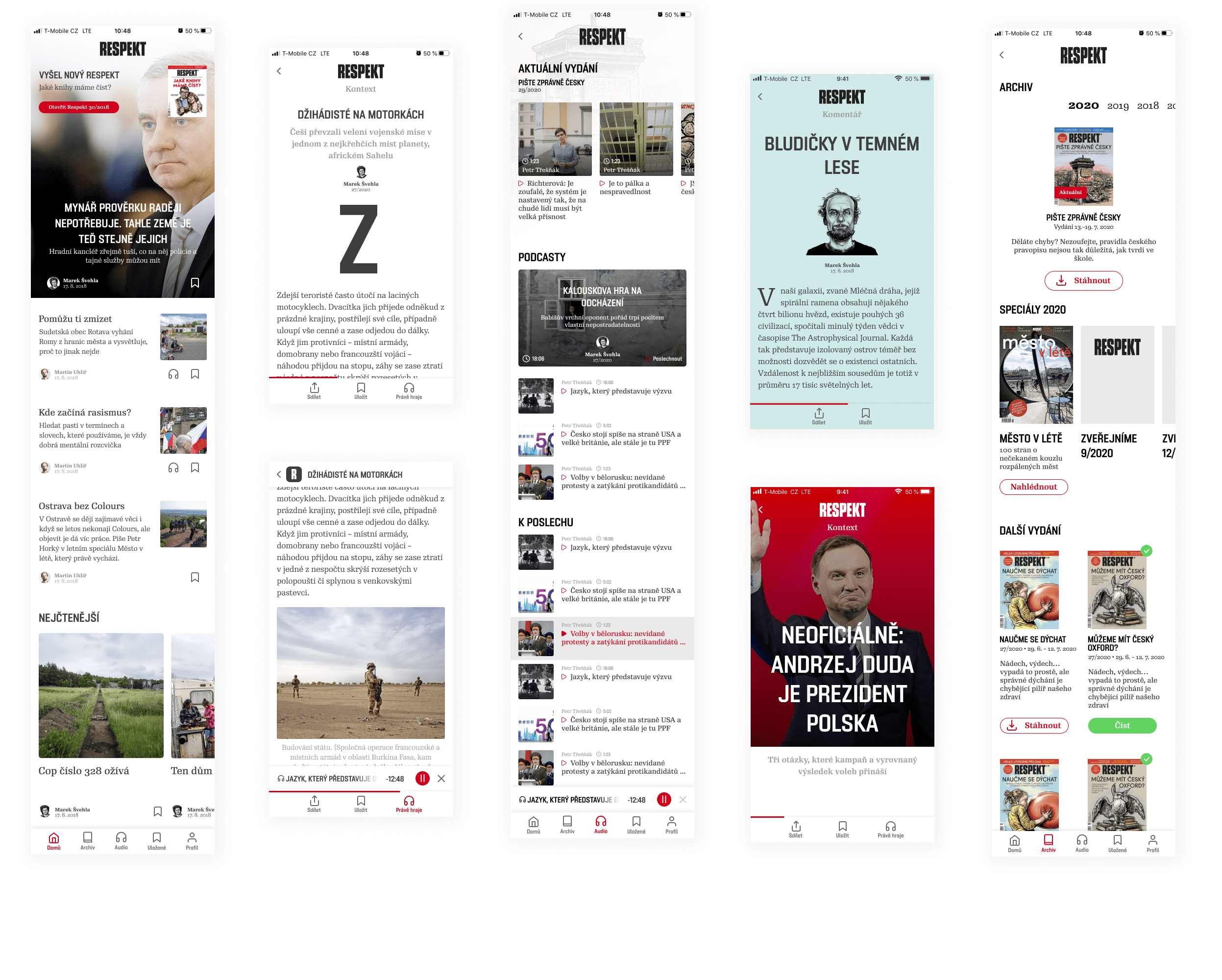
Before
- Navigation was incomprehensible.
- Problematic re-directing of readers in articles/published issues.
- Audio player didn’t have a minimized version.
- UI was complicated, there were lines and frames everywhere
- Dark mode had bad contrast.
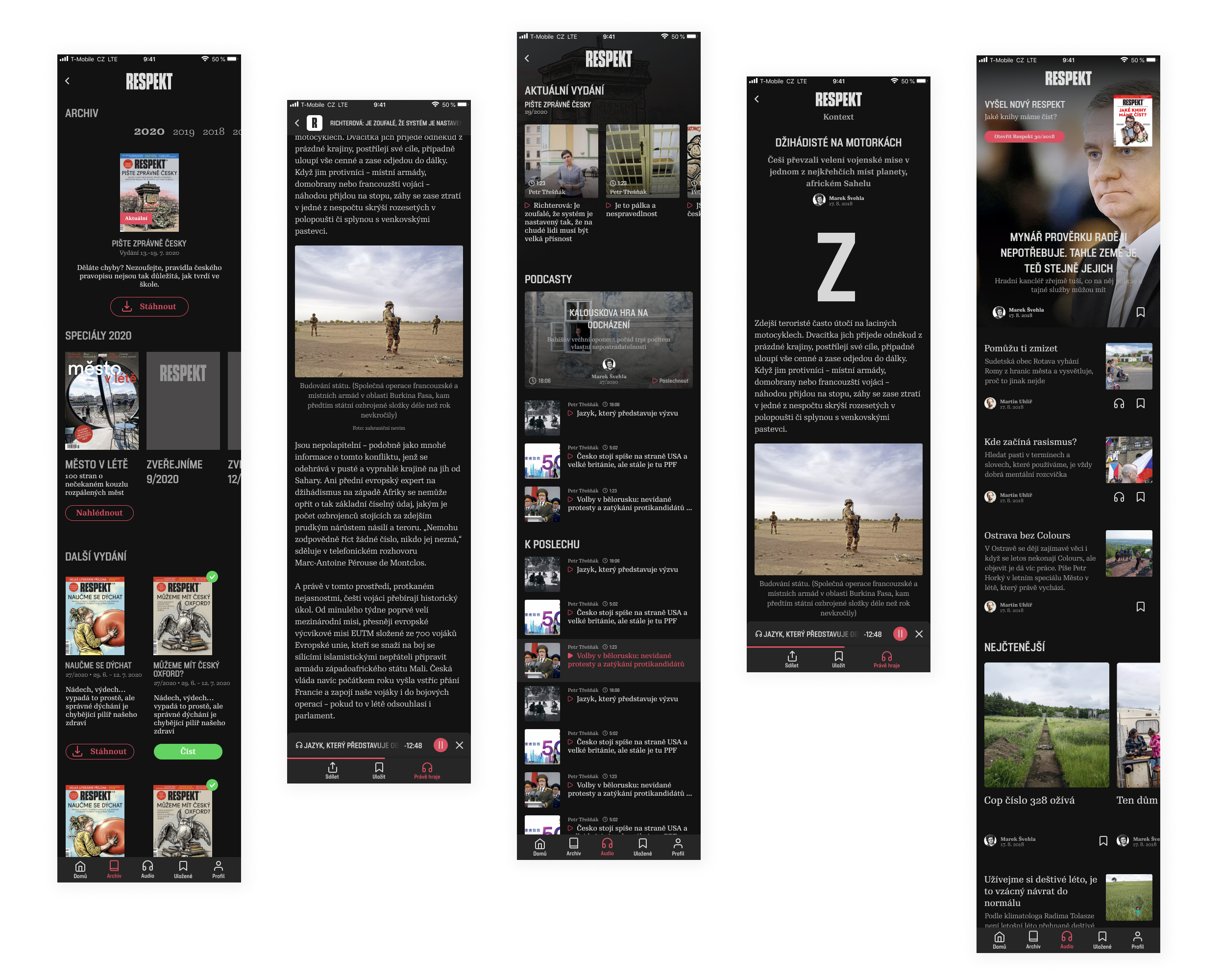
After
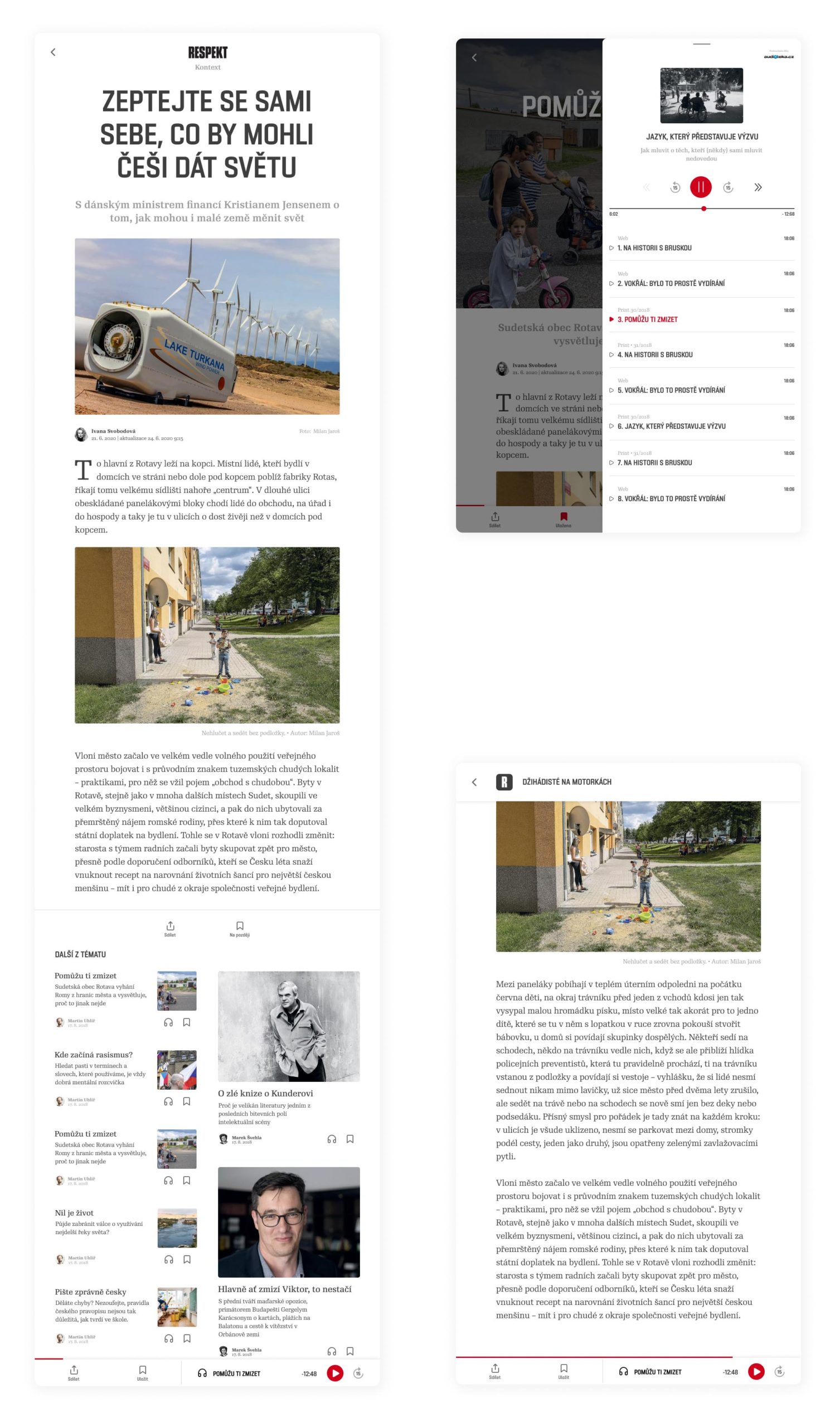
- We made new icons, named them, and put them in context.
- New formats and logic in re-directing of readers.
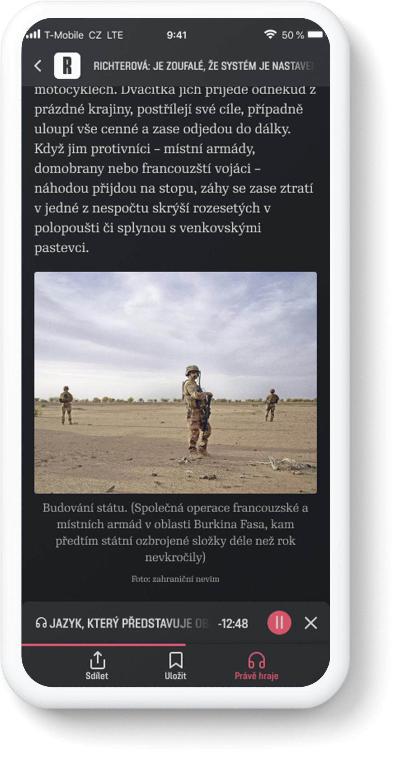
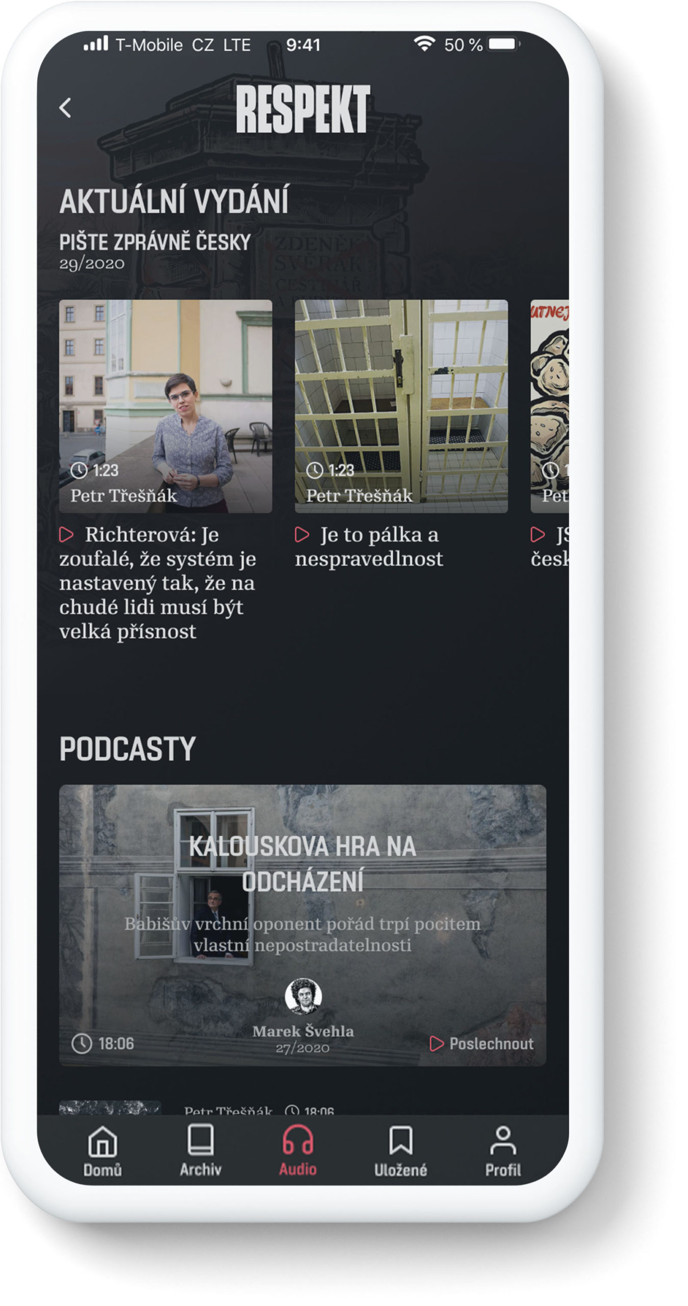
- Whole new audio player
- Polished UI.
- Dark mode has contrast.
- Added progress bar in article.
- Tablet version.
- Loading screen as the cherry on top. :)
Research
The biggest issue were technical problems like log outs, app shutdowns or not remembering where I stopped reading. Most of the comments came in emails or directly in the App store & Google Play. We sorted them according to their technical complexity and number of iterations. After that we tried to comprehend them.


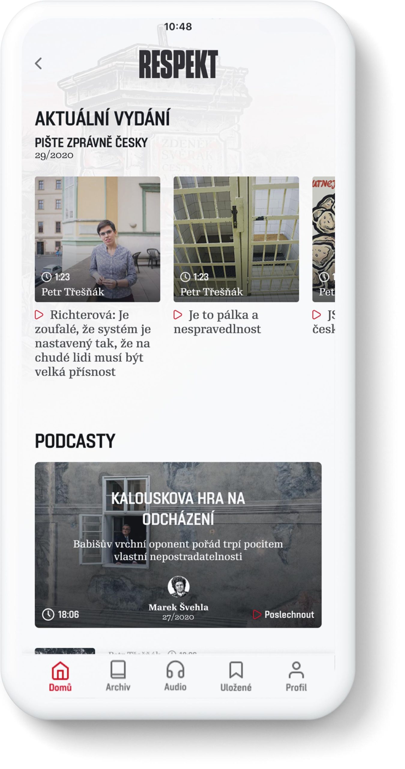
New menu and icons
We wanted to unify actions in every detail of the application. Adding a context menu was a proper solution for that.

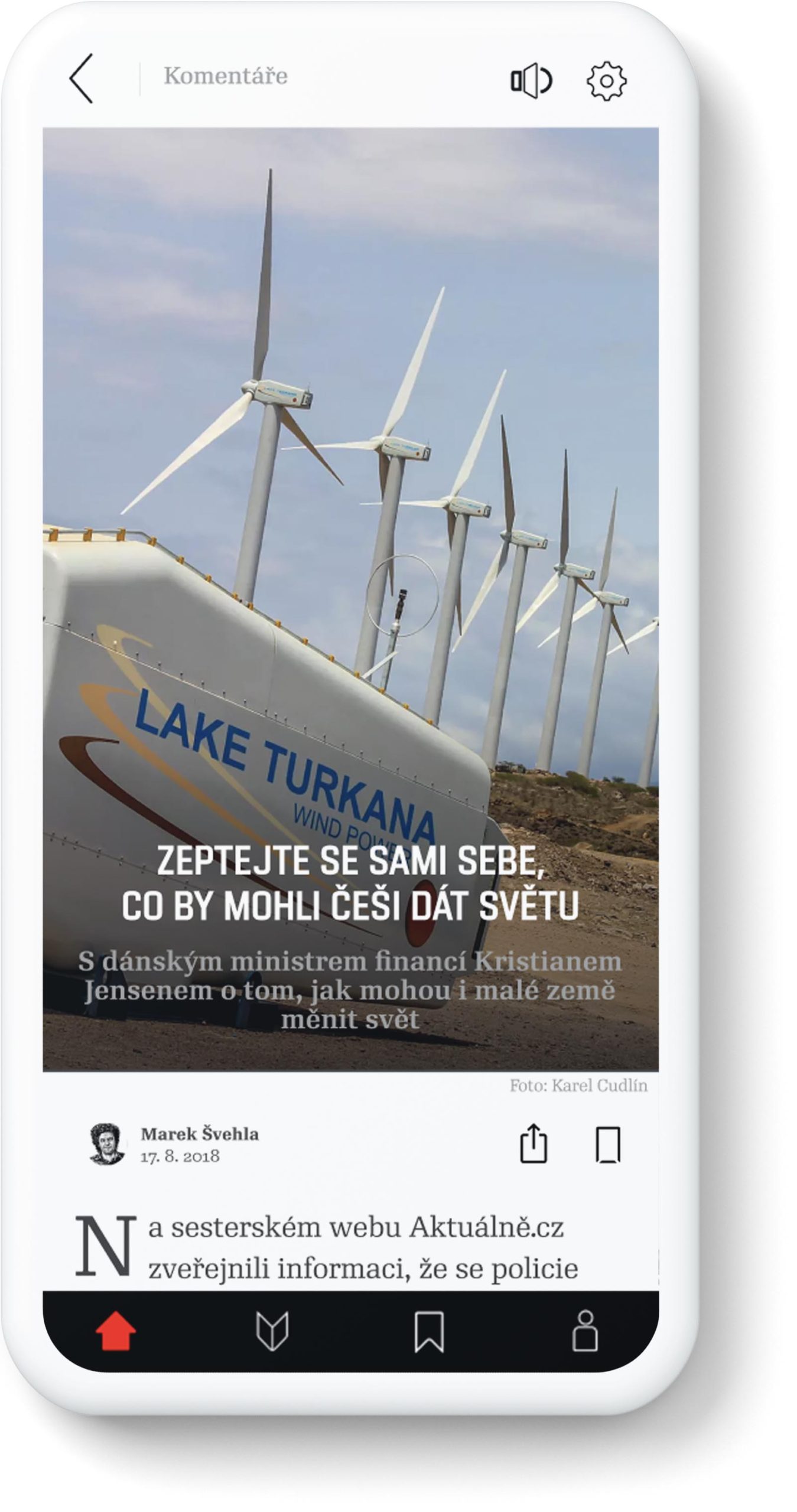
UI changes
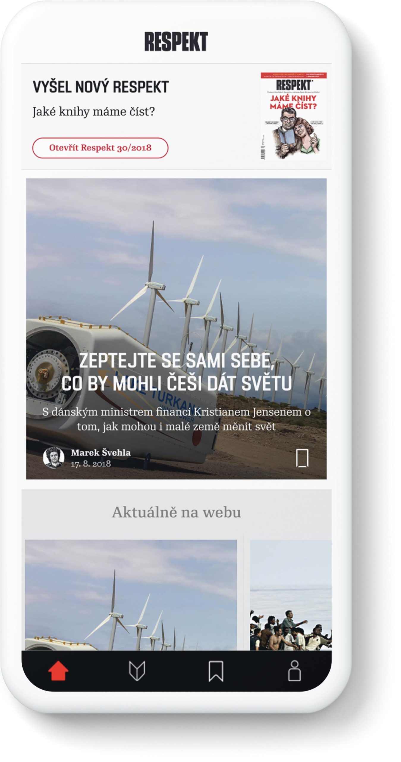
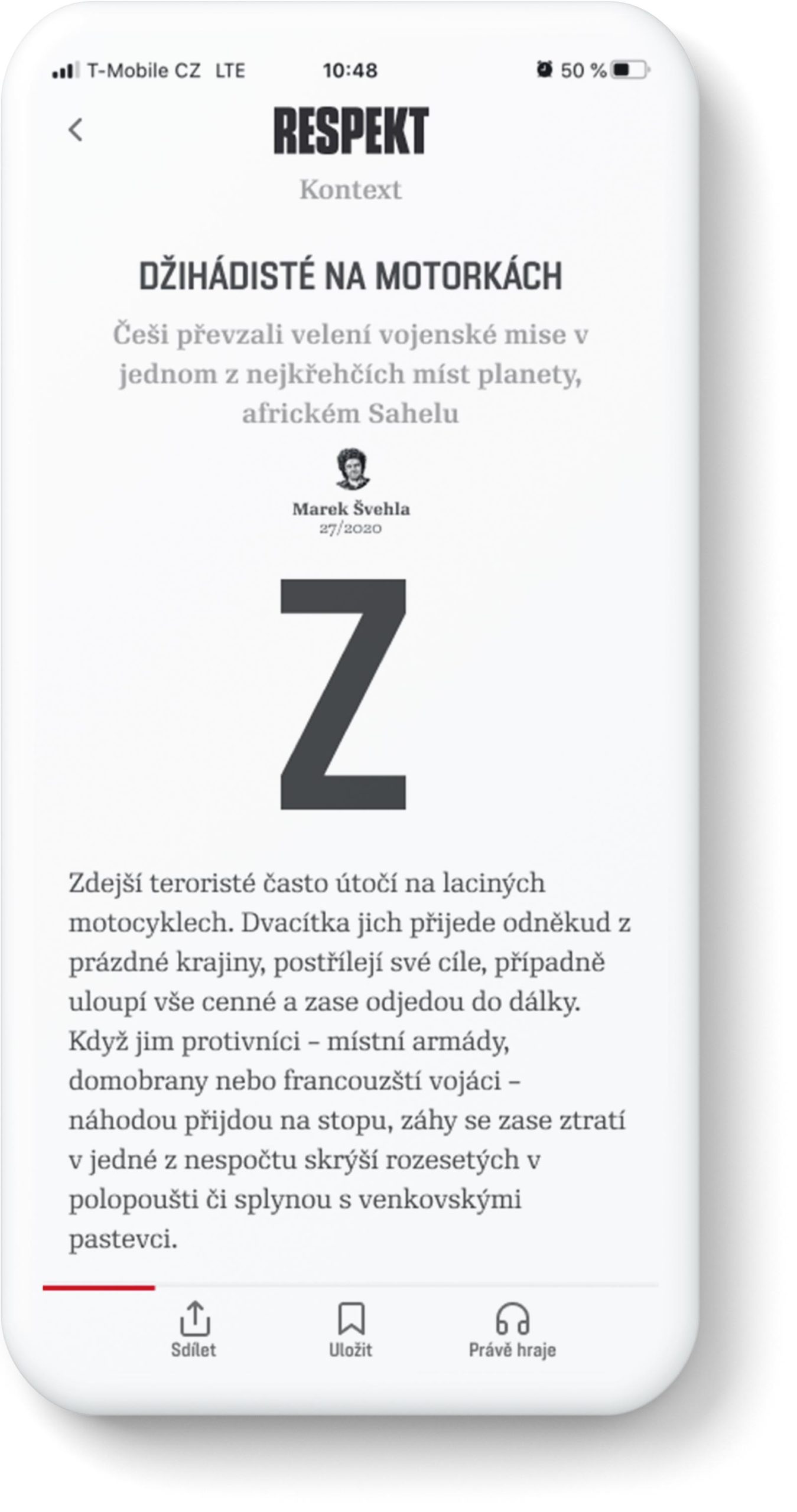
The printed version of the Respekt magazine is really good, for me one of the nicest mass printed magazines in our country.
So, I wanted the app to be designed as closely to the printed version as possible. Initials, colors, white space, labels. Like if you had the printed magazine in your pocket.
Dark mode
It’s my favorite part. For me, the dark mode is not only about saving your eyes and batteries. It is another emotion, when you read articles about life in the outskirts, border towns of Czechia covered in smog and full of poverty and drugs, greedy politicians, or our alcoholic president. That is Respekt.
Dense and dark :)
Tablet
Resizing to tablet mode was must for daily use.
Loading animation
The cherry on top. We tried 2 animations and I'm really happy for the illustrated one.

The end
App is in process of coding and programming. It will be launched in Q2/2020.
Other Works

Ekonom magazineRebranding, UX/UI
Studenta magazineCase study, UX/UI
Economia eshopUI/UX redesign

Sewer boysFanzine about Prague undeground
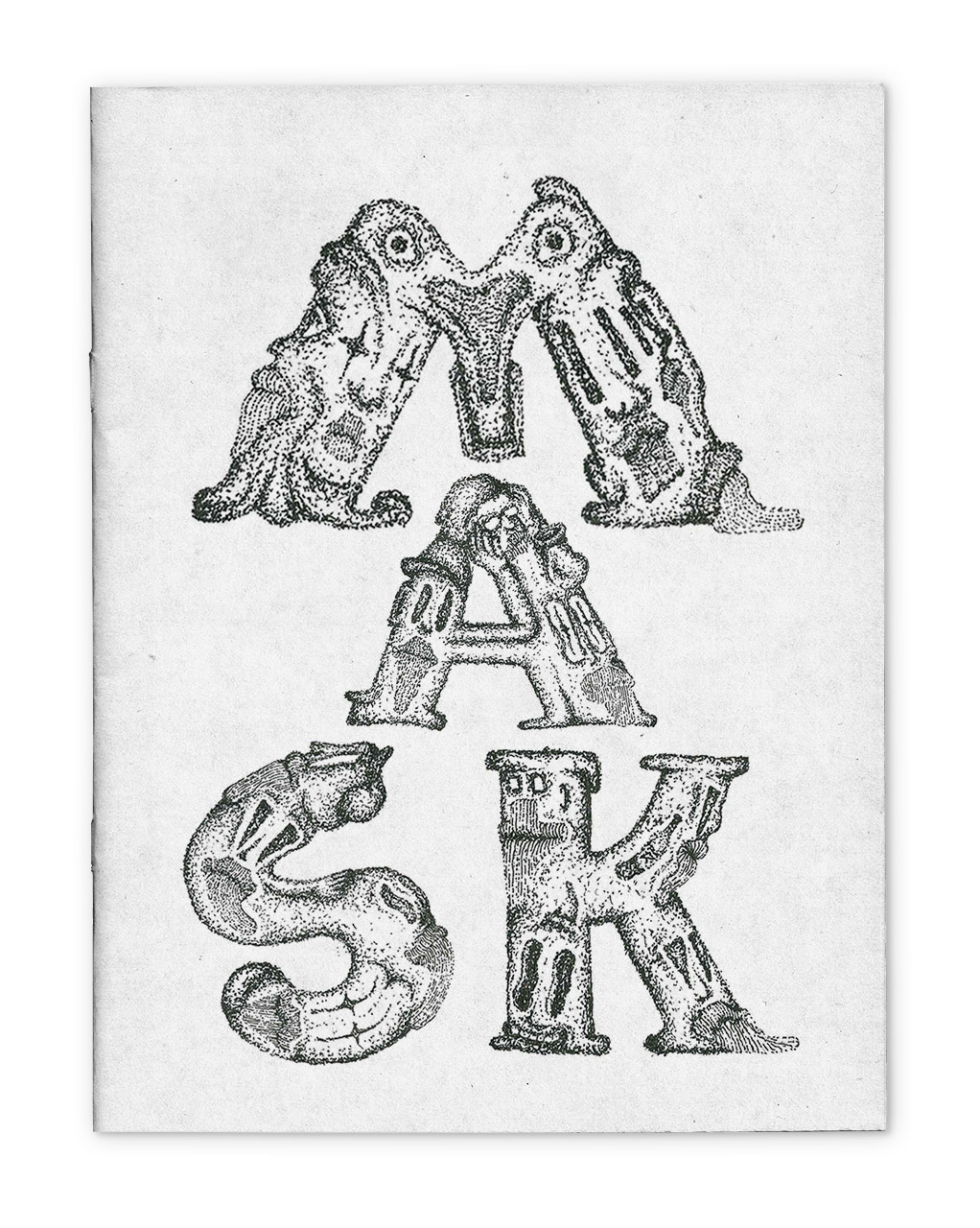
MASKSFanzine about everyday draw
ProtectorEveryday draw
My thingsImprove them
Paintings on the wallillustration
Feel free to call me, or text me.
email: studiorine@gmail.com
phone: +420 737 004 928
© 2021 Matěj Kvasnička