10/2017 - 6/2018
Product design, branding
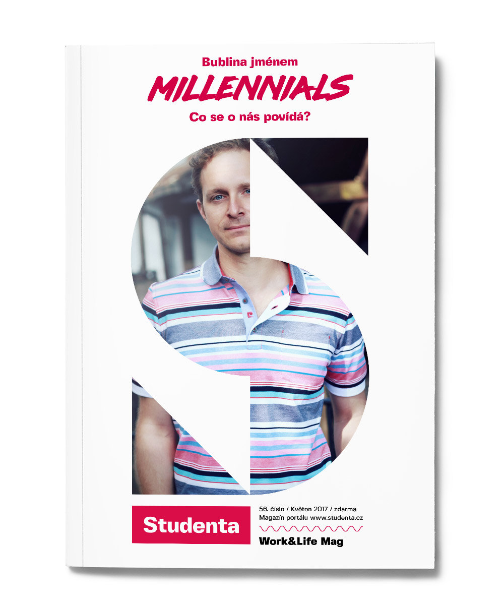
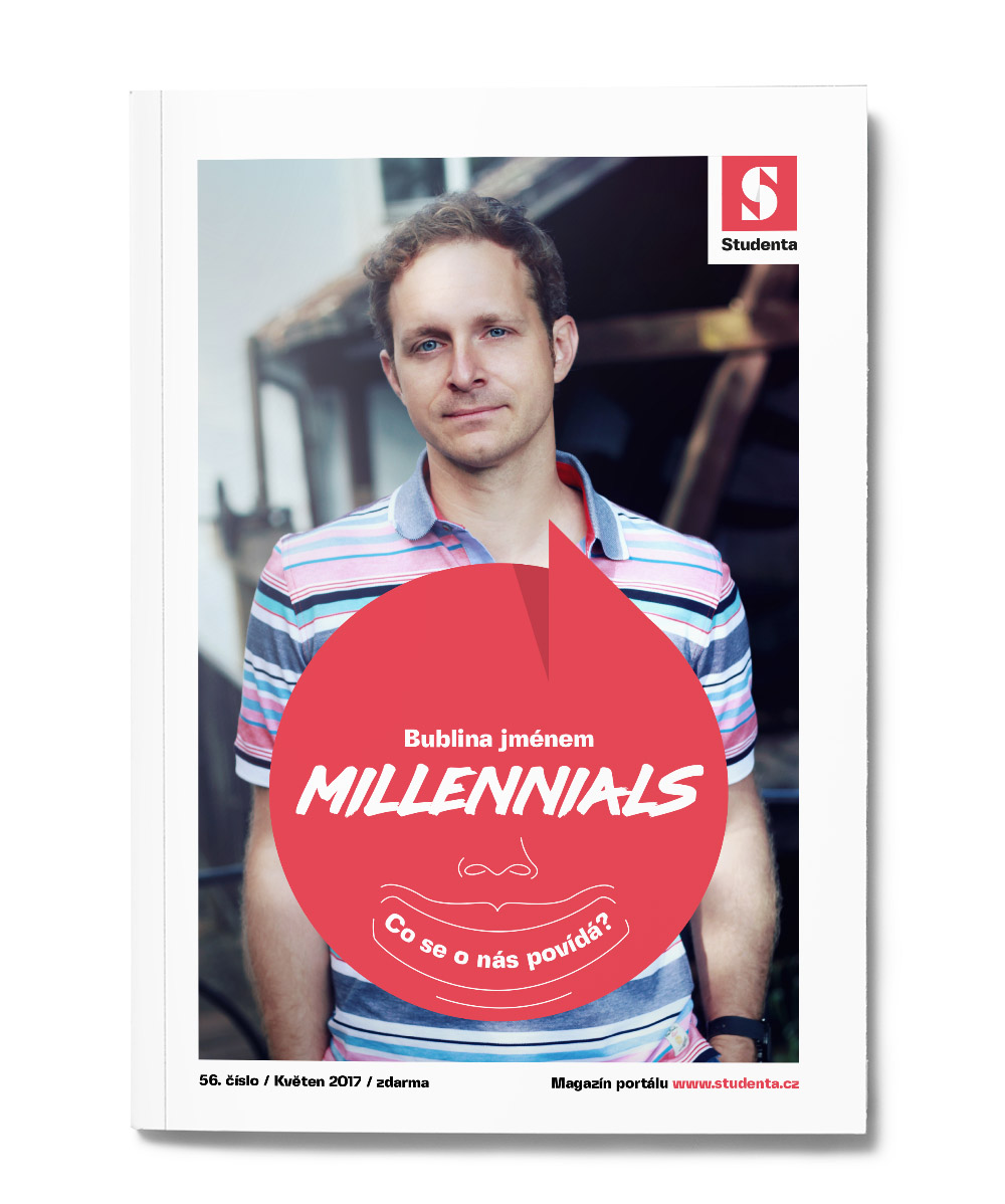
Studenta magazine
Studenta is a magazine distributed in universities around the Czech Republic. The primary content relates to HR, motivations, students tips and success/fuckup stories. The business model was established by big companies that hire young talents. Thanks to the fact that the greatest audience constitutes of young people, the publishing house Economia ended up buying the magazine.
Our goal was to attract the young audience in general, not only students, to integrate Studenta into our framework and guide readers across our product portfolio.
This case study is more about the way I think about design, plus some “behind the scenes”.
Summary
At the time I was only a designer in our company, and this was the first time I oversaw a complete redesign. I needed help.
There were 2 steps to form a new vision of Studenta.
- We chose Outboxers as mentors (focused on design thinking and proof of concept). Together we tested a new project called Hero.
- Update to Studenta 2.0
Step 1 Hero concept
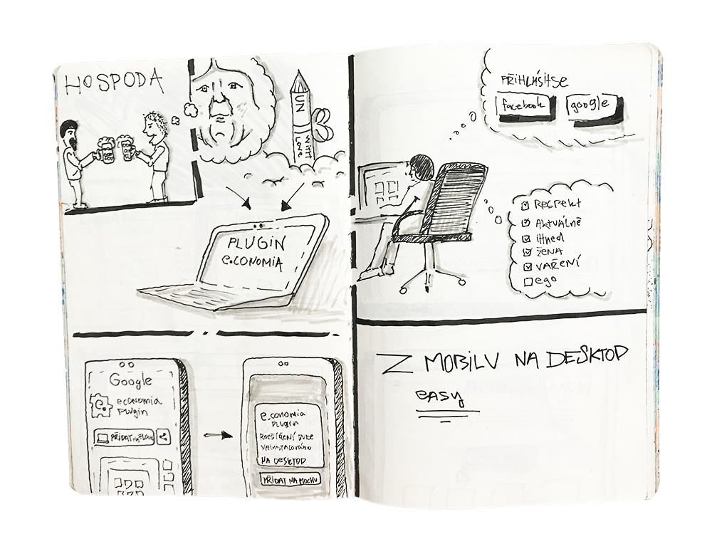
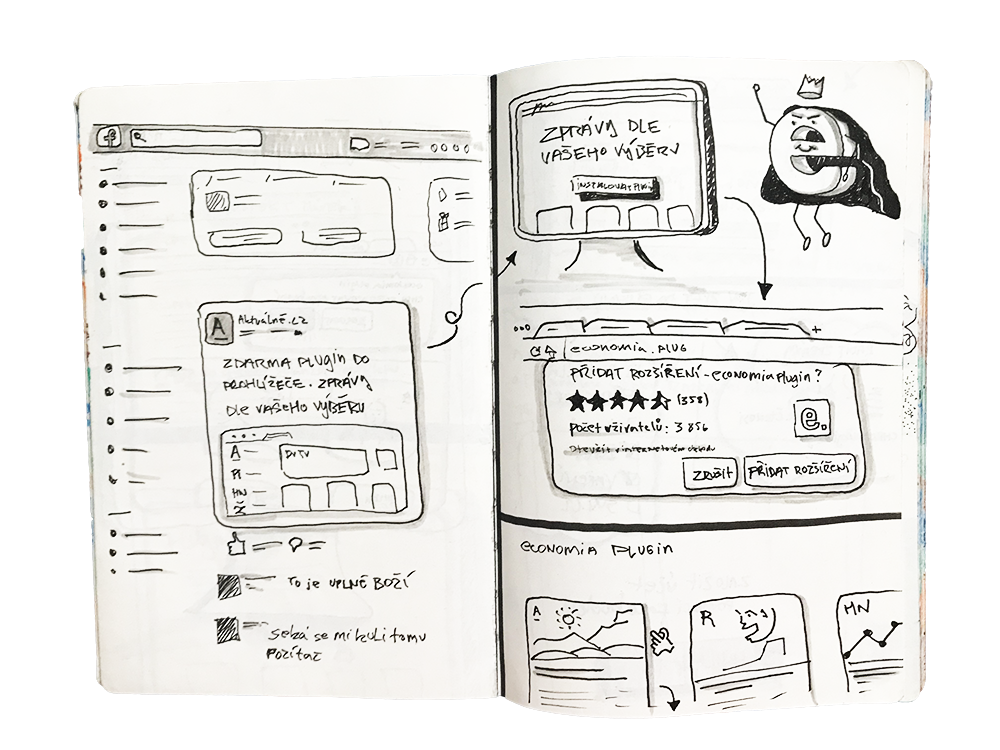
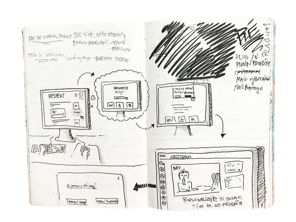
Hero wasn’t just a new magazine. We tried to find new ways such as a physical hub for students where they could go have coffee, meet people on hackathons or at conferences. We also wanted to get a look at users’ devices. We tested the messenger bot with news feed and chrome plugin (we took the same path as muzzli :) "learn from the best"
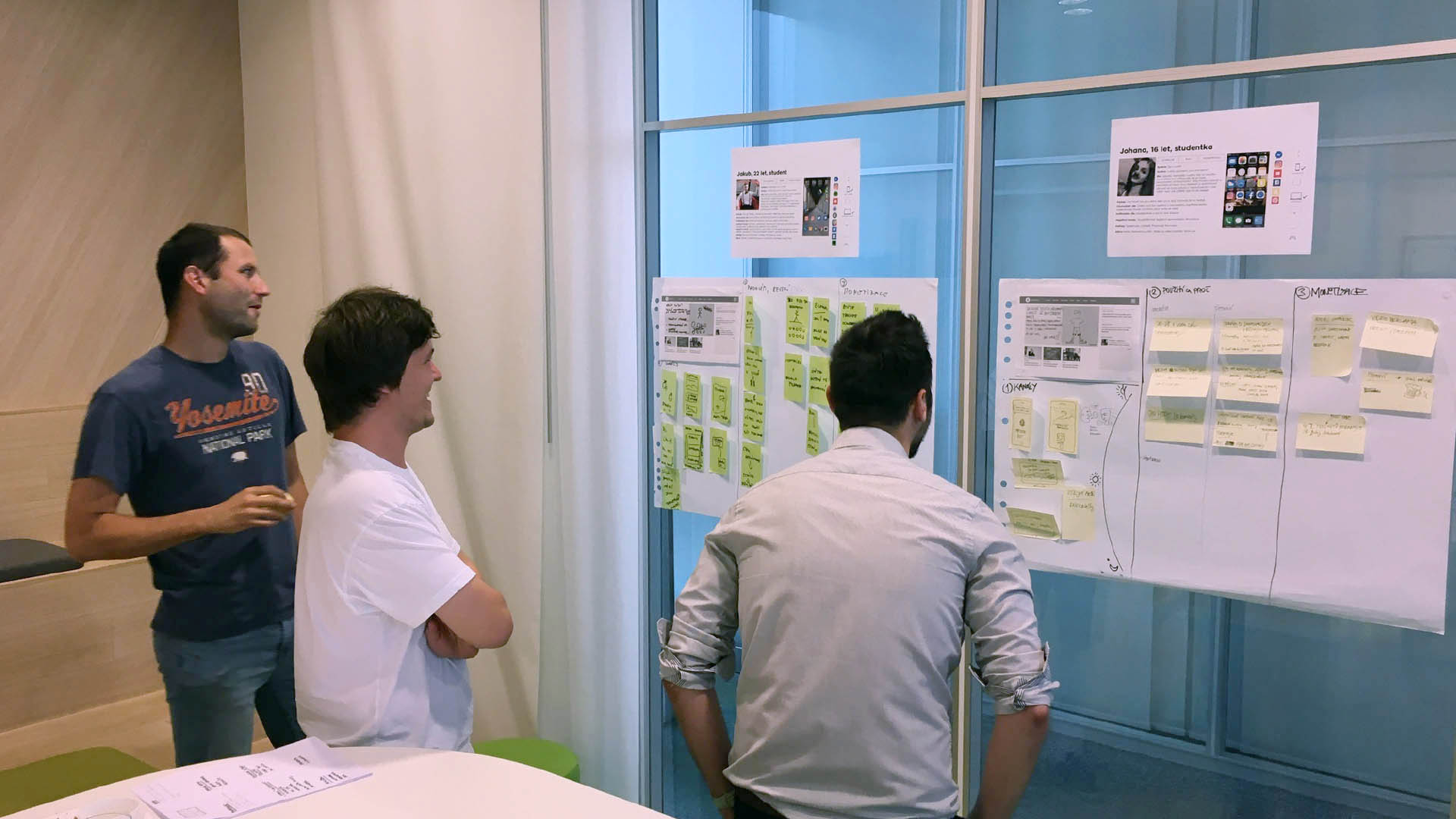
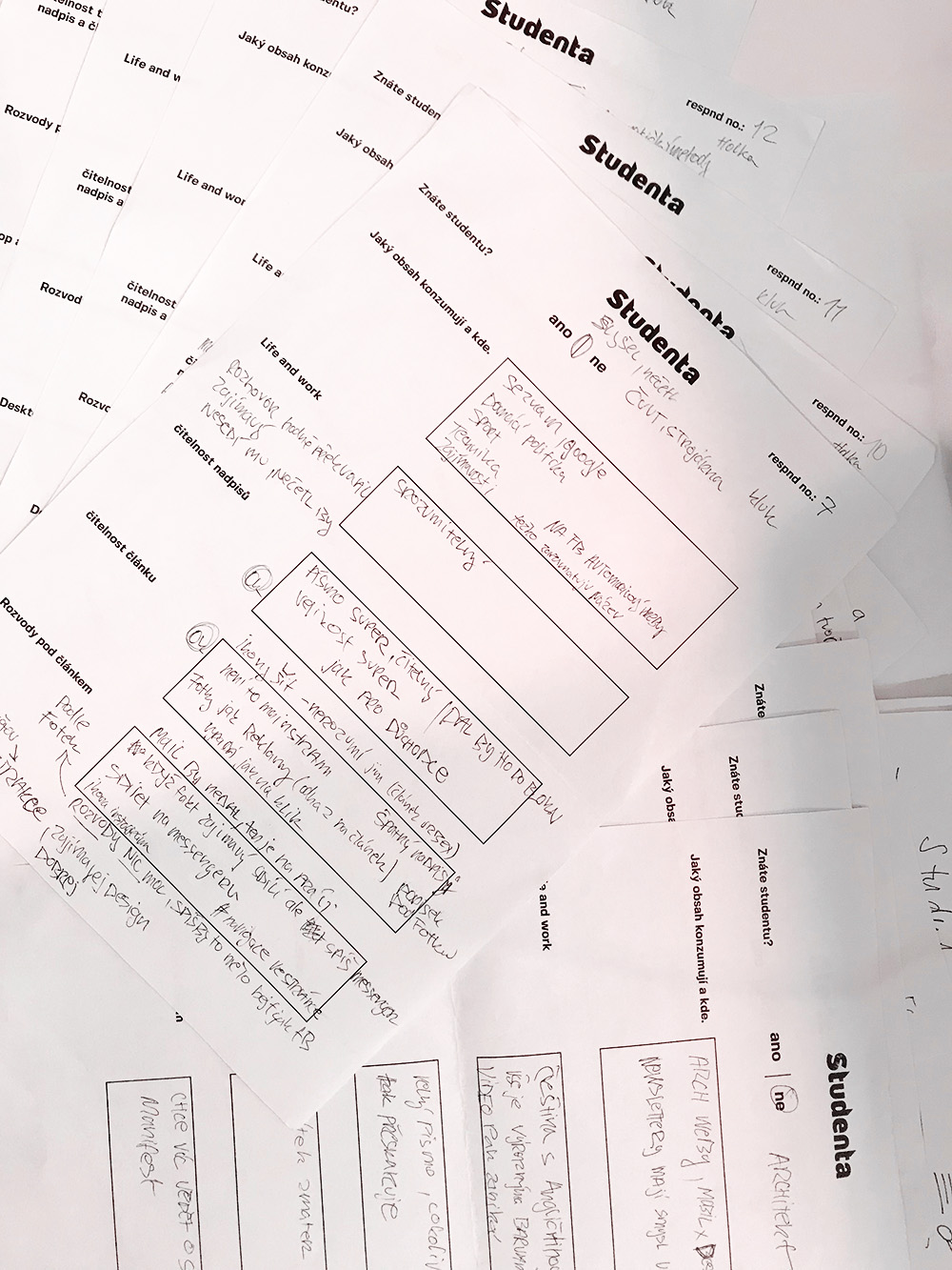
We started with personas and two company workshops. One was focused on millennials, and the question of what we can do for them. The second was with the Studenta team. The topic were identification problems in lifetime cycle of our target group and ideation.
My role was support for Outboxers, taking notes, helping with research, and questioning respondents. And at the end making a prototype.
Ideation workshop
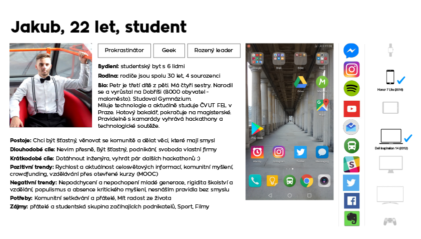
One of our personas
After the workshops, we started working on the prototypes. Making user journeys and preparing for testing.
The Hero website came first. We asked respondents about the type of content (HP), voting about what content they want (categories) and proof of concept (about project).
User journeys
Fun fact: I was unable to write them down properly, so the guys just told me "draw them" and it worked much better.
The Chrome plugin was used for all our brands at the end.
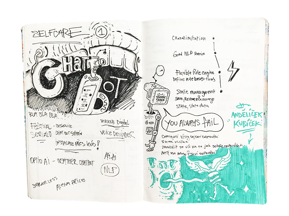
Notes from Chat bot meet up in Prague where I went for tips and tricks.
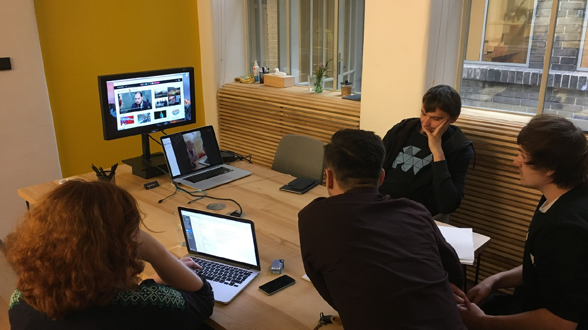
Watching and learning from testing with Outboxers
End of the first step
- All ideas were great, but we got stuck at the business model, our ideas about the hub, and everything was expensive in the long term. The project Hero was dead.
- All this work gave me great insight into our target group and lots of experience for the next step.
Step 2 Studenta 2.0
I must admit that I was a little bit down. I believed in the project Hero and when the management team came with the task to build Studenta 2.0 only with a new website, I was not happy. First, being from a different country. Our business model in all publishing houses across Czechia is based on advertising and especially on one ad called Fireplace. Fireplace is all around the website and leaves you 1080px width for content and there is only small regulation in creatives. All other local websites for millennials leave this ugly ad behind (I must thank this ad for my salary). I felt like I must win a race with Ford Fiesta 2000 against Mustang.
It hurts and I cried (I'm kidding, I never cry). Phewww O.K., I started all over again.
It was important to find where I can beat them. The answer was, not in speed but in the knowledge how to drive. To do it well I needed to know more about my car (Branding - you will see at the end) and who are my opponents. From previous research we knew that our rivals are: Refresher.cz, Bigg Magg, Radio Wave, A2larm (Instagram, YouTube, etc.) great brands, good websites. In the end they are little bit similar. My fight with the desktop ad ended when I realize that almost all youngsters read on their mobile devices.
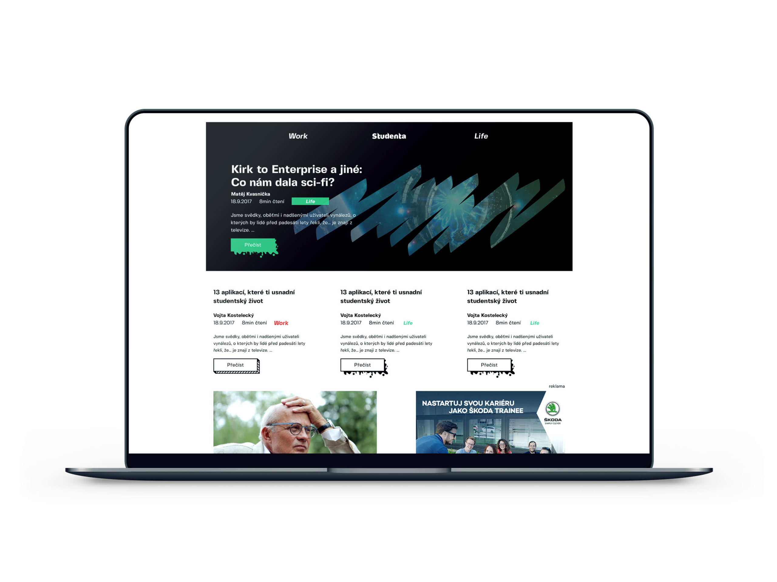
I divided the web app into two halves according to what young people worry about most, Life and Work. I finished the prototype, which I built with a lot of animated buttons and special hovers. And I went testing. When I look back at everything, I am surprised that someone did not have an epileptic seizure.
First version was not nice but helped me realize on what elements I must start build.


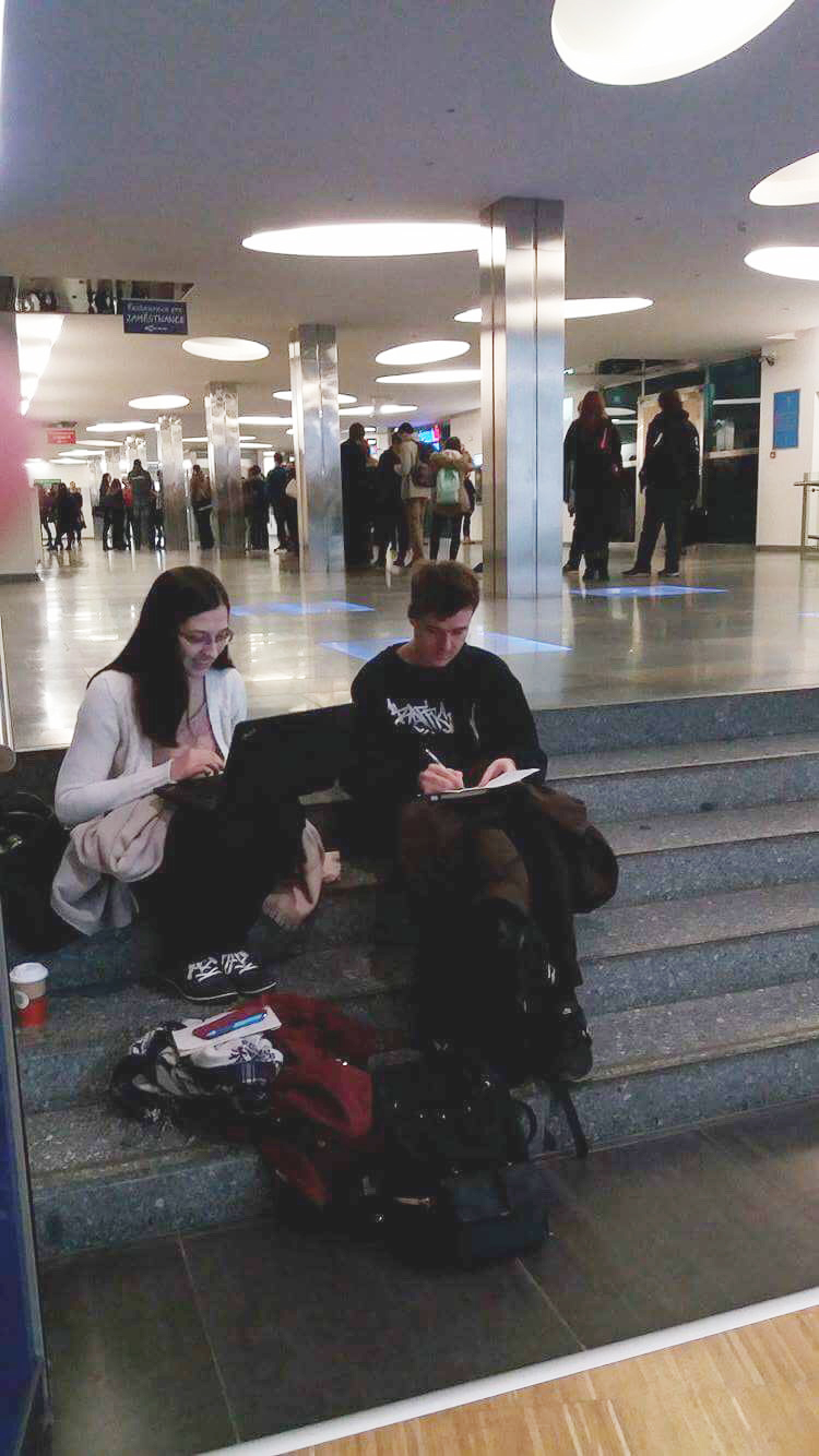
Testing was guerilla. Every week I went to a different place with an upgraded prototype. Mostly universities around the city, libraries, public places. I had a form and testing was about 10-30 minutes. 3–5 testers.
Final stage
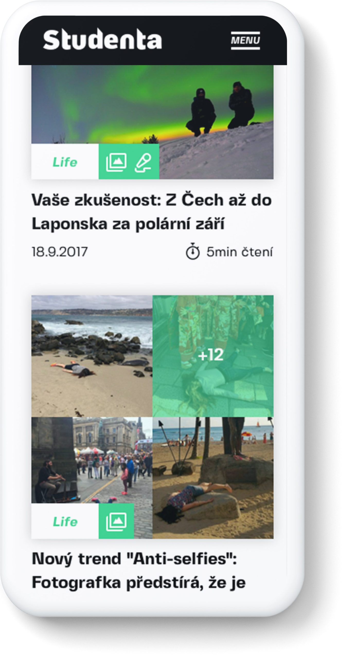
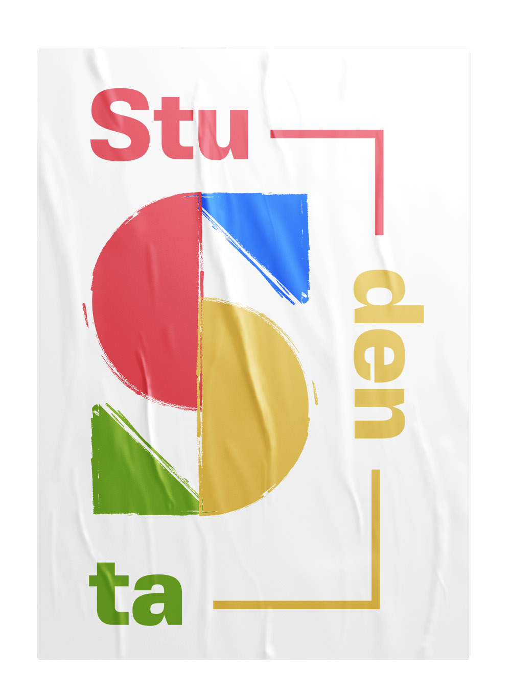
After a few iterations I decided to opt for masks on photos, more white space, great font by a local student. I wanted to be closer to our readers via small details. Like using hashtags in the menu, emojis. We don’t say: this article takes 5 minutes to read. We say 5 minutes on the North Pole or 2 minutes of student tips, etc.
I put ads higher in the page for better visibility -> more money and they don’t disrupt you in the middle of reading.

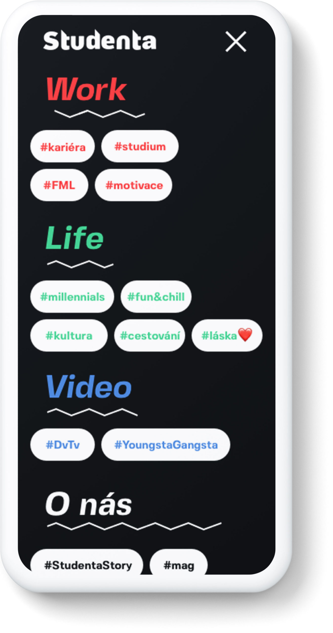
Menu color depends on section of website.
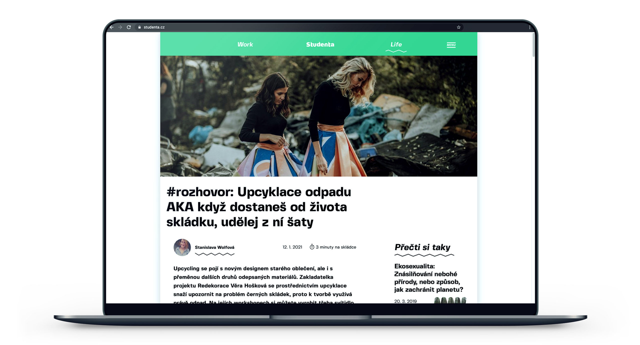
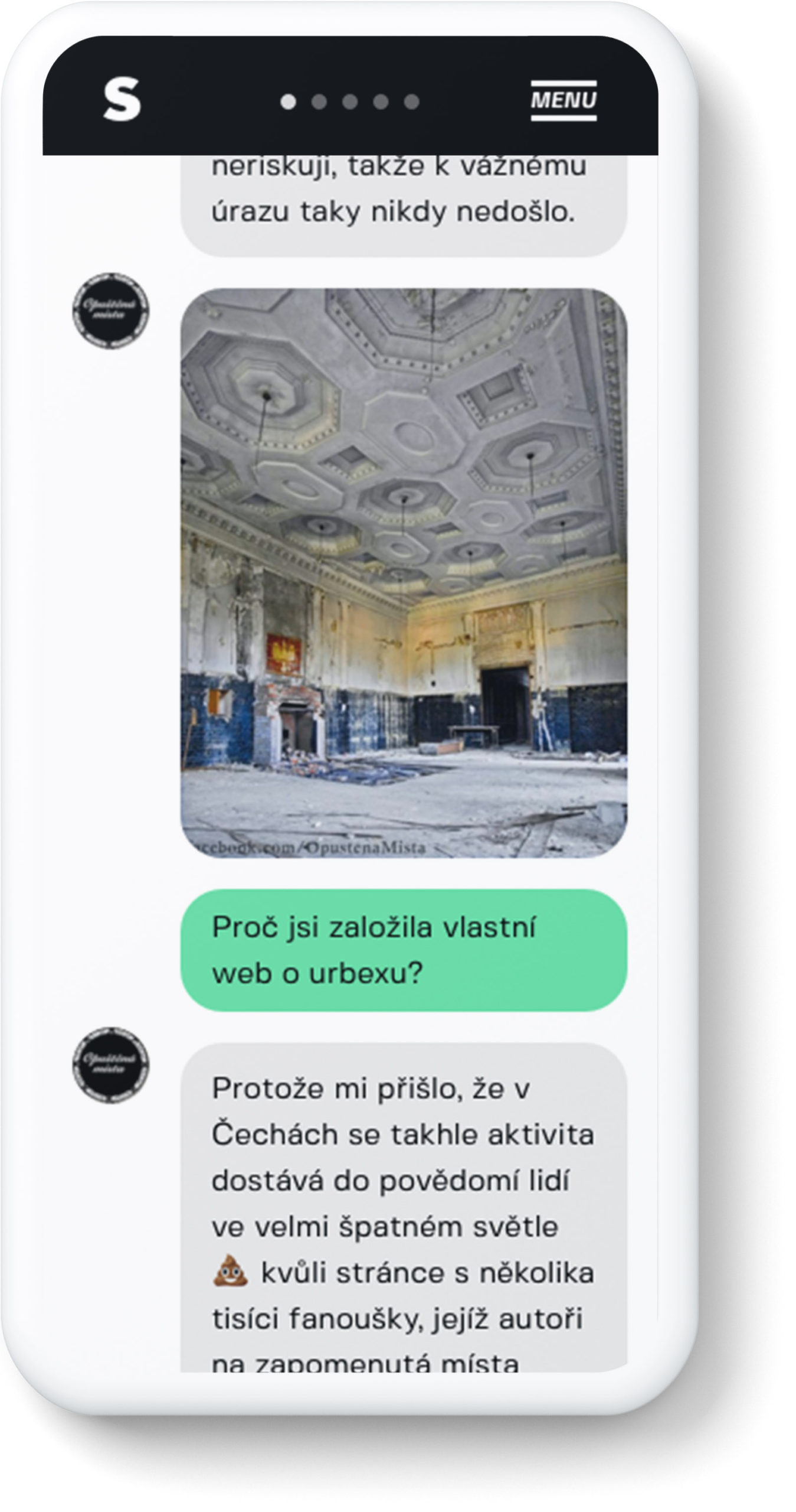
Another special aspect was the interview article. I made it look like you’re reading somebody’s conversation on messenger. Testing it was really interesting. In the first iteration everybody was lost and did not understand what was going on. After setting a clear start and end the chaos disappeared.
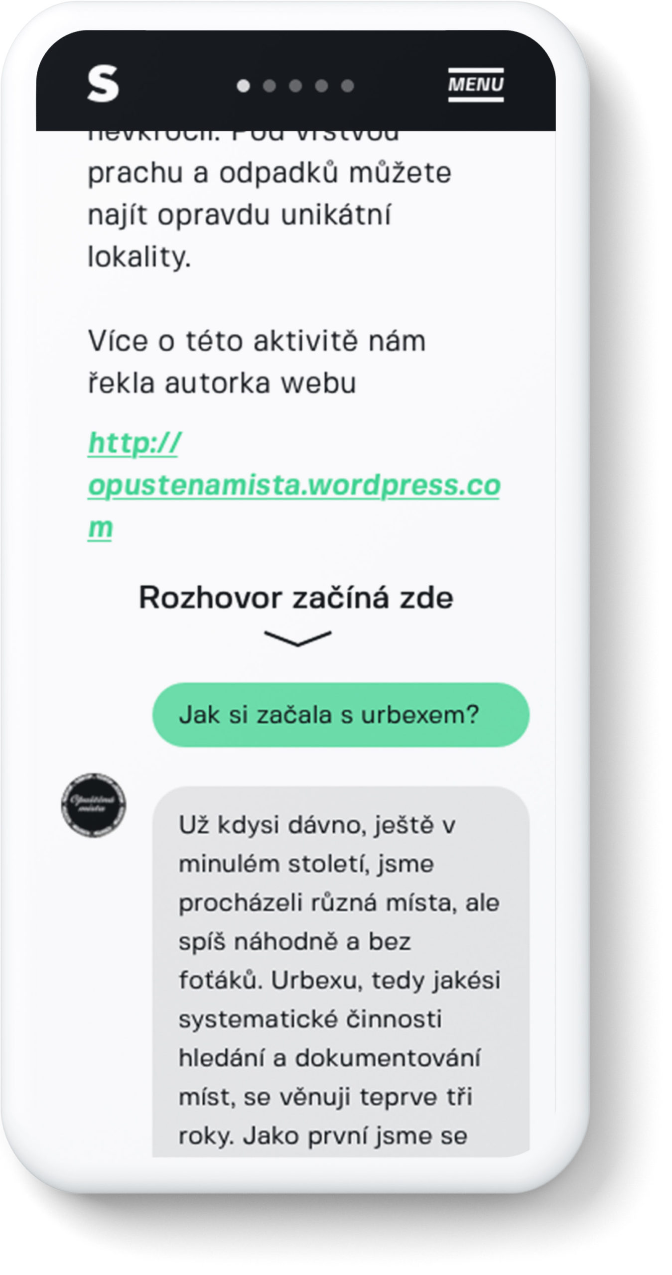
Marking the place where the interview started was important for the users.
For a better reading experience, we didn’t use the zigzag design.
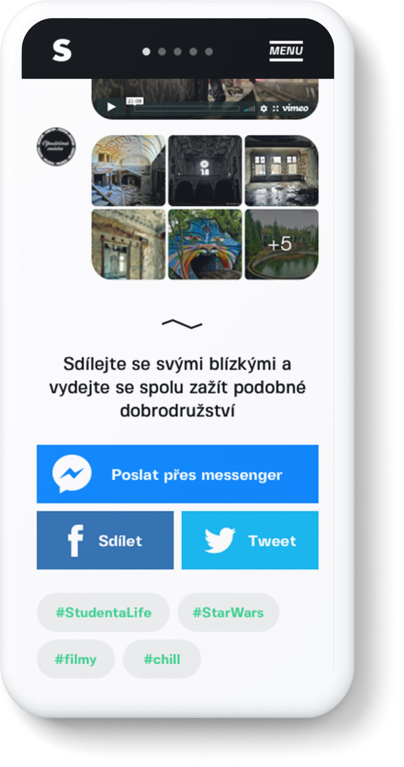
Almost everybody shares articles with friends on messenger.
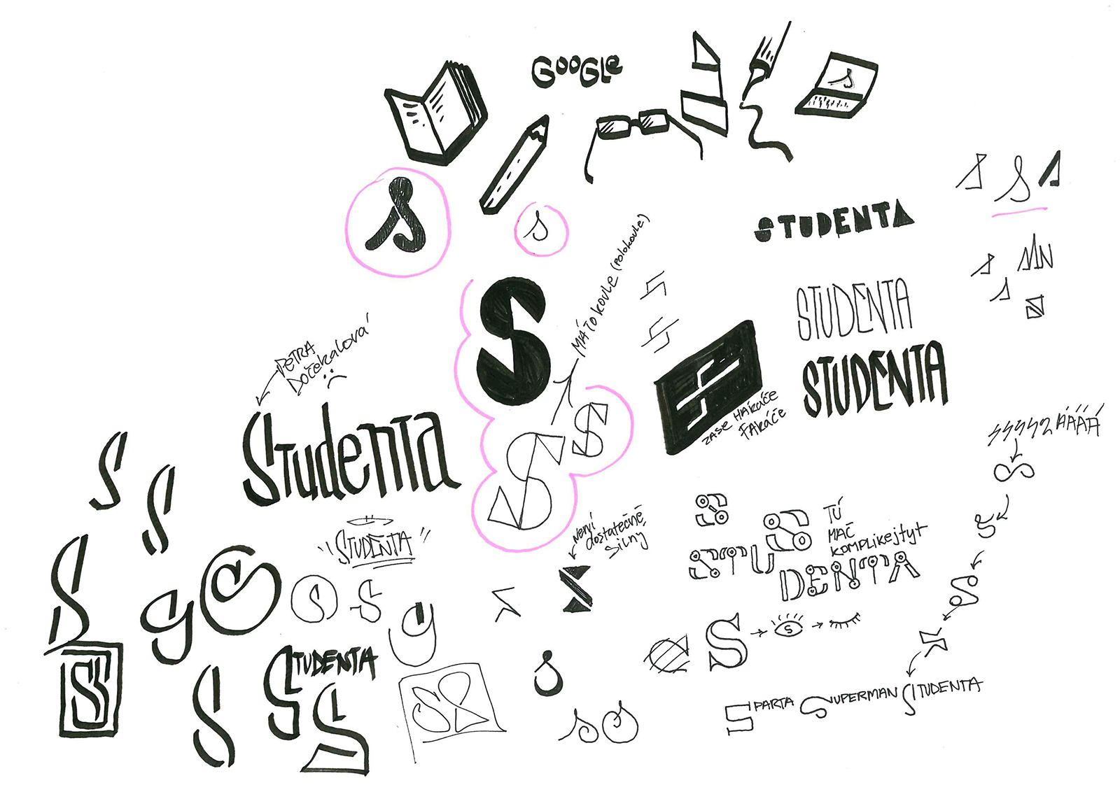
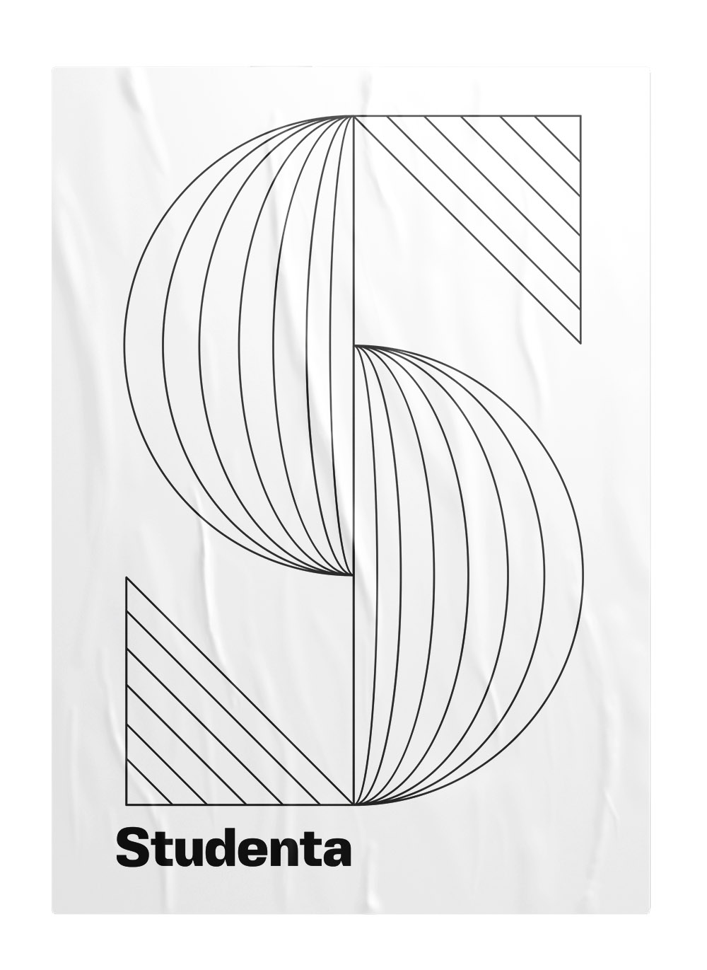
Branding
Old logo.
The End
Long and exhausting. Lots of ups and downs. In the end, big ❤️.
As thank you for this work, I got to be part of Studenta’s project #VyčníWay for which I also made a jingle.
Other Works
Respekt appUX/UI redesign

Ekonom magazineRebranding, UX/UI
Economia eshopUI/UX redesign

Sewer boysFanzine about Prague undeground
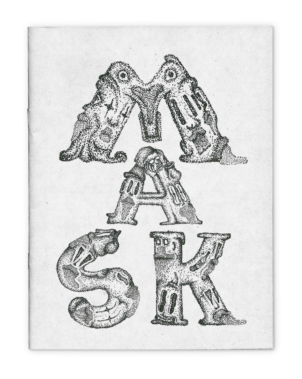
MASKSFanzine about everyday draw
ProtectorEveryday draw
My thingsImprove them
Paintings on the wallillustration